Anchor Pricing Hack: How Solo SaaS Founders Boost Conversions with a Decoy Plan in 2026
A 7-step playbook to raise your SaaS pricing page conversions using a decoy anchor — no redesign needed.
For solo SaaS founders, the layout of your pricing page is often the key part of your funnel.
Research shows many visitors land here while deciding, but if they leave, they rarely come back. Small changes on this page can have a big impact.
One easy move is to add a high-priced decoy plan.
This plan makes the option you want people to pick look better by comparison. Doing this can improve conversion without a full redesign or extra resources.
Price anchoring and the decoy effect (what they are and why they work)
Price anchoring happens when the first price shown becomes the reference point.
A high first price makes the next price feel cheaper.
The decoy effect adds a less-attractive option, usually priced much higher for only a bit more value, so buyers lean toward your target plan.
This makes the mid-tier plan look more appealing.
You can read more about this here: decoy pricing.
The 7-step solo-founder playbook to implement a decoy plan today
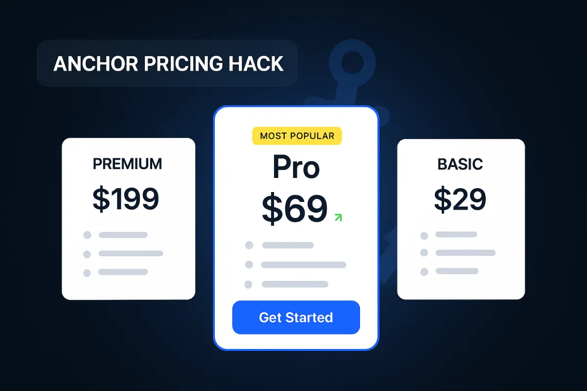
- Lock in a three-tier layout
Use three choices: "Basic," "Pro," and a higher "Premium/Enterprise" decoy. Three options are manageable. Too many confuse people. - Create a high-priced decoy (2–3× your mid-tier)
Give the decoy only a little more value but at a much higher price. The point isn't to sell it, but to make the mid-tier look like a smart pick. - Order to anchor value
Show the high-priced plan first or make it stand out. This sets the reference point so the mid-tier feels cheaper. - Highlight the plan you want people to choose
Mark the mid-tier as "Most popular" or "Recommended." Make it a bit more prominent with size, border, or color. - Make differences obvious with a concise comparison
List only the key differences like seats, usage, or support. Don't overwhelm with long feature lists. - Show annual pricing (with a toggle) and emphasize the savings
Whether you show monthly or annual by default, make the discount clear: "$20/mo or $16/mo billed annually - save 20%." For good examples, see these SaaS pricing page best practices. - Reduce friction at the CTA
If you have a trial, use "Start free trial." If not, add simple reassurances like "Cancel anytime" or "30-day refund." Keep the layout clean.
Case study: How a decoy plan lifted Stock Alarm's revenue
When Stock Alarm shifted from one paid plan to three ($5, $10, $20/month), the high plan helped anchor value. About half of new users picked the top plan. Others preferred the mid-tier but saw it as a better deal. Both cases raised revenue without pressure.
What to put in a short pricing-page
Design and copy details that move the needle
- Show your headline, three plans, and CTA above the fold.
- Use plan names that signal who each is for.
- Keep navigation minimal to avoid distractions.
- Add social proof near the plans and a simple reassurance line near the CTA.
FAQ (3–5 questions)
Keep it short and focused below the plans. Sample questions:
- Do I need a credit card to start a trial?
- Can I change or cancel my plan anytime?
- What happens if I exceed my plan limits?
- Do you offer refunds?
- Is my data secure and how is it protected?
This keeps visitors from leaving to look for answers.
When to show \"Contact us\"
Only use this for custom enterprise deals. For others, transparent pricing works better.
Why this works: anchoring plus simplicity
This method stacks small advantages:
- The decoy sets a high reference point.
- The mid-tier looks like the smart choice.
- A short comparison and FAQ reduce doubt.
- A clear layout with a low-risk CTA increases clicks.
A/B testing landing page copy - Test small changes on your pricing page and keep what works.
Quick checklist you can run this afternoon
- Add a third tier with a high-priced decoy (2–3× mid-tier).
- Place the high tier first; highlight mid-tier as \"Most popular.\"
- Keep comparison simple and clear.
- Show monthly and annual prices with savings.
- Use \"Start free trial\" or a reassurance line on buttons.
- Add 3–5 FAQs about billing, limits, refunds, and security.
- Remove distractions; keep CTA visible above the fold.
- Optionally, build fast with Webflow and refine copy with Frase.
Zero-budget marketing tactics for solo founders - Practical ideas that pair well with pricing-page updates.
Citations
- For more on decoy pricing: decoy pricing.
- For SaaS layouts and CTA examples: SaaS pricing page best practices.
- For insights on visitor behavior: pricing-page UX analysis.