Landing Page Conversion Rate Optimization Guide

So, what is landing page conversion rate optimization, really? It’s all about tweaking your page—methodically and with data to back you up—to get more visitors to take that one specific action you care about. We’re talking about small, smart changes to your headline, your call-to-action, and your design that guide more people toward a sale, a signup, or a download.
Quick Wins for Immediate Conversion Lifts
You don’t need a developer on speed dial or a massive budget to see real improvements. As a solo operator, your time is everything. This playbook is all about high-impact, low-effort fixes you can knock out in under an hour to get results now.
These quick wins are about building momentum. By starting with tangible changes, you create a solid baseline for more advanced testing down the road. The immediate goal? Stop visitors from bouncing and guide them smoothly toward that one conversion goal.
High-Impact 60-Minute Fixes
I've put together a quick table of the highest-impact tasks you can tackle in about an hour. These are the things I'd check first on any landing page to plug the most obvious leaks.
| Optimization Task | Time Estimate | Potential Impact | Recommended Tool |
|---|---|---|---|
| Sharpen Headline & Value Prop | 20 min | High | QuillBot for rephrasing ideas. |
| Simplify & Clarify CTA Button | 15 min | High | Your own website editor. |
| Declutter Above the Fold | 15 min | Medium | A critical eye and the delete key. |
| Add a Single, Clear Testimonial | 10 min | Medium | Copy/paste from customer feedback. |
Focusing on just these few things can make a surprising difference without getting bogged down in complex experiments.
Sharpen Your Headline and Value Proposition
Your headline is the first thing a visitor reads. You get about three seconds to convince them to stay. It has to answer one question with absolute clarity: "What's in it for me?"
Forget clever taglines. Go for a direct benefit. A powerful value proposition, sitting right there "above the fold"—the area everyone sees without scrolling—is your best defense against a high bounce rate. It needs to instantly tell them the best thing they'll get from your offer.
For instance, "The Future of Project Management" is vague. "Finish Projects 50% Faster, Without the Meetings" is specific, benefit-driven, and gets the point across immediately.
Simplify Your Call-to-Action
One of the most common conversion killers? A cluttered page with too many choices. Your landing page should have exactly one job and one compelling command to do it.
Research shows that pages with a single primary call-to-action (CTA) convert around 13.5% on average. In contrast, those with five or more links see that number drop to about 10.5%. Every extra link is a potential exit route that distracts from your main goal.
Get ruthless. Remove competing links, secondary buttons, and especially the main site navigation menu. Your CTA button should be visually distinct, use action-oriented text (like "Get Your Free Plan" instead of "Submit"), and be impossible to miss. If you need a quick design update to make your CTA pop, you can find affordable designers on Fiverr who turn things around fast.
Declutter and Remove Distractions
Visual clutter creates cognitive friction. It forces visitors to think too hard about where to look and what to do next. Every single element on your page—every image, icon, and block of text—must support the primary conversion goal.
Ask yourself: Does this help the user convert? If the answer isn't a clear "yes," get rid of it.
Here are a few common culprits to hunt down:
- Stock Photos: Cheesy, generic stock photos scream inauthenticity. Swap them out for real product screenshots, team photos, or custom graphics that actually add value.
- Excessive Text: Nobody reads walls of text online. Break up long paragraphs into short, scannable sentences. Use bullet points and bold text to highlight key benefits.
- Competing Visuals: Your design should guide the user's eye toward the CTA, not away from it. Use white space as a tool to create a clean, focused layout.
These simple adjustments can make a huge difference. For more ideas, check out these 10 actionable CRO tips. To keep everything organized as you work, our conversion rate optimization checklist is a great way to stay on track.
Building Your CRO Measurement Toolkit
You can't fix what you can't see. Trying to boost your landing page conversion rate without the right data is like driving blindfolded—sure, you're moving, but you're probably headed straight for a ditch. The goal here isn't to drown yourself in dashboards. It's to build a lean, powerful toolkit that shows you why people are bouncing and what makes them stick around.
With the right setup, you can stop guessing what’s broken and start knowing. You'll turn user behavior into a clear roadmap for what to fix next.
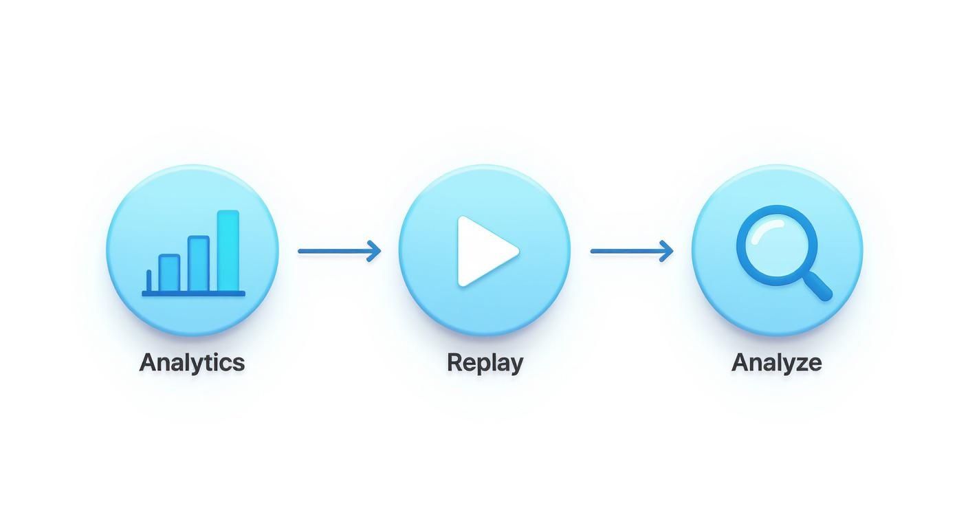
Start with Foundational Analytics
First things first, you need to track the absolute basics: where are your visitors coming from, and are they actually doing the one thing you want them to do?
Google Analytics is the industry standard here, and it’s more than powerful enough for our needs. If you're looking for a simpler, privacy-focused alternative, something like Fathom is a fantastic choice that cuts through the noise.
Whichever you choose, getting it running is usually a simple copy-paste job. Most landing page builders like Webflow or Leadpages have a spot in their settings where you can drop in a small tracking snippet. Done.
Your first and most critical task after installation is setting up a conversion goal. This is how you tell your analytics tool what "success" actually looks like. Is it a form submission? A button click? A visit to your /thank-you page? Define that one action, clearly. If you need a hand, our guide on setting up Google Analytics for your small business walks through this step-by-step.
See Your Page Through Your Users' Eyes
Analytics tells you what happened. Session replay tools show you why.
These tools create anonymous recordings of user sessions, letting you watch exactly how real people interact with your landing page. You’ll see where their mouse hovers, where they click in confusion, and the precise moment they give up and leave.
I'm not exaggerating when I say that watching just five session recordings can reveal more about your UX problems than a month's worth of charts. You might find your main CTA is broken on mobile, or that one awkward sentence is making everyone hesitate.
This kind of qualitative feedback is pure gold. It helps you build a quick list of obvious fixes and sharp hypotheses for testing. Tools like Hotjar or Crazy Egg have free tiers that are perfect for getting started, and installation is just as easy as your analytics tool.
Analyze Competitor Messaging with Simple Scrapers
Your landing page doesn't exist in a vacuum. Your visitors are almost certainly looking at your competitors, and you need to know what they're seeing. How do your rivals frame their value? What benefits do they scream from the rooftops? What words do they use to build trust?
Checking every competitor page by hand is a soul-crushing task. A simple web scraper makes this ridiculously efficient.
You can set up a tool like PhantomBuster to automatically visit a list of competitor URLs and pull key text, like:
- H1 Headlines: How are they grabbing attention right away?
- Subheadings: What are the key benefits they're pushing?
- CTA Text: What specific actions are they asking for?
- Testimonial Snippets: What kind of social proof are they leaning on?
Dump all this into a spreadsheet, and you’ll instantly spot patterns, find gaps in your own messaging, and get some great ideas for your next A/B test. This turns competitive analysis from a chore you do once a year into a systematic, ongoing part of your CRO process.
Running Hypothesis-Driven A/B Tests
Let's be honest, "A/B testing" often sounds like something reserved for data science wizards at huge companies. But it's not. At its core, it's just making an educated guess and then letting your actual users tell you if you're right or wrong.
This is the entire game of landing page conversion rate optimization. We're moving away from "I think this will work" and into the much more powerful "I know this works better."
The whole process is a simple, repeatable loop. You dig into your analytics, watch how people are actually using your site with session recordings, and then form a clear hypothesis. From there, you run a controlled test, analyze what happened, and let the results guide your next move. This takes the guesswork and emotion out of design changes and puts cold, hard data in the driver's seat.
This cycle is what turns your landing page from a static brochure into a living, breathing asset that's always getting better.
Forming a Strong Hypothesis
Every test that's worth running starts with a strong hypothesis. A vague idea like, "Let's try a green button," is a waste of time. Why? Because it doesn't explain why you're making the change or what you actually expect to happen.
A solid hypothesis is a clear, testable statement. It needs to include the change you're proposing, the outcome you predict, and the reasoning behind it.
Here’s a simple formula you can lean on:
"If I change [Element X], then [Predicted Outcome Y] will happen, because [Reasoning Z]."
Let’s make this real. Imagine you're watching session recordings and see a bunch of users hovering over your CTA button but never clicking. Something's holding them back.
- Your Hypothesis: *If I change the CTA button text from "Submit" to "Get Your Free Checklist," then the click-through rate will increase by 15%, because the new text clearly communicates the immediate value and removes the friction of a generic command.*
See the difference? Now you have a measurable goal and a clear rationale. This is a real experiment, not just a random tweak.
Prioritizing Your A/B Test Ideas
As a solo operator, your time is your most valuable asset. You can't test everything at once, so you have to be ruthless about prioritizing. The key is to weigh the potential impact against how much effort it'll take to actually build and launch the test.
Changing a headline? That's usually quick. Redesigning the entire page layout? That's a much bigger project.
A simple framework I love for this is the ICE score: Impact, Confidence, and Ease. Rate each idea from 1-10 on these three factors and average them out. The ideas with the highest scores go to the top of your list. It keeps you focused on changes that will actually move the needle without getting bogged down.
This table gives a good starting point for how to think about prioritizing your tests.
Prioritizing Your A/B Test Ideas
| Test Idea (Element) | Potential Impact (High/Med/Low) | Implementation Effort (High/Med/Low) | Priority Score |
|---|---|---|---|
| Main Headline | High | Low | 9 |
| Call-to-Action (CTA) Button | High | Low | 9 |
| Hero Image/Video | High | Medium | 7 |
| Social Proof Placement | Medium | Low | 6 |
| Form Length/Fields | Medium | Medium | 5 |
| Page Layout Redesign | High | High | 4 |
Start with the high-impact, low-effort changes—like your headline and CTA—to get some quick wins under your belt.
Common Pitfalls to Avoid
Even with a perfect hypothesis, it's surprisingly easy to mess up a test and get bad data. One of the biggest mistakes I see is calling a test too early. It's incredibly tempting to stop an experiment the second one version pulls ahead, but you have to wait for statistical significance.
This requires a certain number of visitors and a long enough run time to be valid. Thankfully, most A/B testing tools—like the one built into Unbounce—will tell you exactly when you've hit that mark. Just be patient.
Another classic mistake is testing too many things at once. If you change the headline, the CTA, and the hero image in a single variation, you'll have no idea which change actually caused the lift (or drop!) in conversions. It muddies the waters completely.
Stick to testing one significant change at a time. If you’re really focused on messaging, our guide on A/B testing landing page copy gets into the weeds of how to craft variations that win.
How Page Speed Bleeds Conversions
A slow landing page is the silent killer of conversions. When we talk about optimizing a landing page, speed isn't just a nerdy technical detail—it’s a core part of the user experience that hits your bottom line directly. Every millisecond you make a visitor wait is another opportunity for them to lose patience and bounce forever.
Put yourself in their shoes for a second. Someone clicks your ad, excited to see what you've got. They're met with a blank white screen. One second passes. Two seconds. That initial excitement quickly turns to friction, then doubt. Before they even read your headline, the delay is screaming that your brand is slow, unprofessional, or just plain broken.
The Real-World Cost of a Slow Page
The link between load time and conversion rates isn't a theory; it's a hard fact proven by mountains of data. Faster pages don't just perform a little better—they crush their slower counterparts.
We're not talking small numbers here. B2B sites that load in just one second see conversion rates up to three times higher than those taking five seconds. For B2C, it's a 2.5x increase. The data even shows that every extra second of delay can slash conversions by 7%. You can dig into more of these CRO stats to see just how deep the rabbit hole goes.
Let that sink in. If your page takes a mere three seconds longer to load than a competitor's, you could be flushing over 20% of your potential conversions down the drain before anyone even sees your offer.
Finding Your Speed Bottlenecks
Okay, so we know it’s a problem. But before you can fix anything, you need a diagnosis. The good news is you don't need to be a developer to figure out what's bogging you down. Your first stop should always be Google's PageSpeed Insights.
Just plug in your landing page URL, and it’ll spit out a performance score for mobile and desktop. But the real gold is in the "Opportunities" section—a prioritized checklist of exactly what to fix.
You’ll probably see a few usual suspects pop up:
- Serve images in next-gen formats: This is a fancy way of saying your PNGs or JPEGs are ancient history. They need to be converted to modern, efficient formats like WebP.
- Reduce initial server response time: Your hosting might be sluggish, or your site's backend is taking its sweet time thinking about the request.
- Eliminate render-blocking resources: This means certain scripts or style files are cutting in line, loading before your actual content and forcing visitors to stare at a blank page.
Don't get intimidated by the technical jargon. Just focus on the items with the biggest "potential savings." More often than not, it's all about images and code bloat.
Quick Fixes for an Instant Speed Boost
Now for the fun part—actually making things faster. You’d be surprised how many of the biggest wins are completely non-technical.
1. Crush Your Images. Aggressively.
I’m not kidding. Huge, unoptimized images are the #1 cause of slow landing pages. Before a single image gets uploaded, it needs to be run through a compression tool. My go-to's are TinyPNG or Squoosh. These can shrink file sizes by a whopping 50-80% with almost zero noticeable loss in quality. If you're using a platform like Shopify or Webflow, this one step alone can take your page from sluggish to snappy.
2. Turn On Browser Caching.
Browser caching is a simple instruction that tells a visitor's browser to save static files—like your logo, stylesheets, and key images—on their own device. The next time they visit, the page loads almost instantly because it doesn't have to re-download all that stuff. Most modern platforms and hosts have a simple toggle for this in their settings. Find it and flip it.
3. Cut Down on HTTP Requests.
Think of every single element on your page—every image, script, icon, and font—as a separate "request" the browser has to make to your server. More requests mean more waiting. It's time to be ruthless. Go through your page and ask:
- Do we really need that extra social media sharing script?
- Can we combine multiple CSS files into one?
- Is there a third-party widget we can live without?
Every single thing you remove is a small but meaningful victory for speed.
Using Social Proof to Build Trust
Great copy makes promises, but powerful social proof makes those promises believable. You can write the most persuasive headline in the world, but your visitors are naturally skeptical. They've been burned before. Their default setting is disbelief.
This is where you have to strategically dismantle their hesitation by showing them that real people—just like them—have already won with your offer.
Weaving these trust signals into your page is a massive part of CRO. It’s about more than just sprinkling a few quotes around. It’s about building an undeniable case that choosing you isn't just a smart decision, but a safe one.
The Undeniable Power of Video
Text is easy to skim. Video is hard to ignore.
A short, well-placed video can communicate your value with more clarity and emotional punch in 60 seconds than an entire page of text. Honestly, it’s one of the highest-leverage additions you can make.
The data backs this up. Research shows that adding a relevant video to a landing page can boost conversions by as much as 80%. It just grabs and holds attention far better than static content, which is probably why around 30% of the top-performing landing pages use them. If you want to go deeper, check out these landing page performance stats to see just how much of a difference it makes.
Here are a few ways I’ve seen this work incredibly well:
- Explainer Video: A short, animated video that breaks down what your product does and who it's for. It replaces confusion with instant clarity.
- Founder-to-Camera: A direct, personal message from you. This builds an immediate human connection and is a killer move for consultants or service providers.
- Customer Testimonial: The holy grail. Nothing beats a happy customer explaining in their own words how you solved their problem.
And you don't need a Hollywood budget. For crisp, professional voiceovers, a tool like Murf.ai can turn a simple script into a studio-quality audio track. If you've already got long-form stuff like a webinar, you can use Opus Clips to automatically find the best moments and repurpose them into bite-sized clips perfect for a landing page.
More Than Just Testimonials
While video is a heavy hitter, a layered approach to social proof always works best. You want to surround your main call-to-action with different types of trust signals that appeal to different visitor psychologies.
This means moving beyond a simple quote. The goal is to provide multiple, varied pieces of evidence that your offer is legitimate, popular, and effective.
The most effective social proof feels specific and authentic. "This service is great!" is forgettable. "We increased our sign-ups by 47% in the first month using this tool" is specific, credible, and much more persuasive.
Building Your Credibility Stack
Think of your social proof elements as a "credibility stack." Each layer you add gives more weight to your claims and helps overcome a different kind of visitor doubt.
Here’s what a solid stack looks like:
- Specific Customer Testimonials: Go for quality over quantity. Pick two or three quotes that highlight different key benefits. Always include a name, company, and a real photo of the person—it makes the testimonial feel tangible and real.
- Case Study Snippets: Pull out the single most impressive metric from a case study and feature it prominently. A simple line like, "Helped Company X achieve a 250% ROI in 6 months," is incredibly powerful.
- Trust Badges and Logos: Have you been featured in a well-known publication? Do you have certifications or security badges (like for an e-commerce checkout)? Displaying these logos lets you borrow credibility from established brands.
- Real-Time Activity: A subtle notification like "Jane from New York just signed up!" can create a sense of urgency and belonging. It shows that other people are taking action right now.
- Reviews and Ratings: For local services or physical products, embedding reviews is non-negotiable. Services like NiceJob can help you automate collecting and displaying customer reviews, ensuring you always have a fresh stream of positive feedback.
By combining these elements, you create a persuasive environment that makes the decision to convert feel both logical and safe. This thoughtful application of social proof is a cornerstone of any successful landing page optimization strategy.
Turning Optimization Into a Habit
Great landing pages aren't built and forgotten. They're evolved. If you treat conversion rate optimization as a one-off project, you're leaving money on the table. The real gains come from building a simple, repeatable system—a loop that turns optimization from an occasional fire drill into a core business habit.
This is where you shift from "fixing" a page to constantly improving it based on what your users are actually doing. It’s how you stack small wins over time to create massive growth.
The Can’t-Skip Pre-Flight Checklist
Before any new page goes live or you kick off a fresh optimization cycle, run it through this quick checklist. This simple sanity check catches the silly mistakes we all make and keeps you honest about the fundamentals.
The Essential Pre-Launch & Optimization Checklist:
- Clarity Check: Is the headline's benefit crystal clear? Can a visitor understand "what's in it for me?" in less than 3 seconds? Seriously, count it out.
- Frictionless UX: Is the layout clean and dead simple to follow? Have you ruthlessly cut every unnecessary link or navigation item that could distract from the main goal?
- CTA Punch: Is there one primary call-to-action that's impossible to miss? Does the button copy use an action word? (Think "Get My Free Plan" instead of the soul-crushing "Submit").
- Need for Speed: Are all images compressed? Use a tool like TinyPNG. Does the page load in under 3 seconds? Test it.
- Mobile-First Reality: Does the page look and feel great on a phone? Is the CTA button easy to tap with a thumb without zooming?
- Proof & Trust: Have you placed specific, believable testimonials or trust badges near the CTA? This is your secret weapon against last-second hesitation.
Your New CRO Routine
The best operators don't wait for conversion rates to tank before they take action. They have a simple rhythm for staying ahead of problems and spotting new opportunities. This doesn't need to eat up your week.
The goal here isn’t to drown in data. It’s to build a rhythm for reviewing feedback, spotting patterns, and deciding what to test next. A predictable process kills the guesswork and guarantees your page keeps getting smarter.
Here’s a dead-simple routine you can start today:
- Weekly Analytics Check-In (15 Minutes): Every Monday, glance at your analytics. What's your main conversion rate? Where is traffic coming from? How are desktop and mobile performing? Just look for any big spikes or dips that warrant a closer look.
- Monthly Session Replay Dive (30 Minutes): Once a month, grab a coffee and watch 5-10 new session recordings. You're hunting for moments of frustration—rage clicks, confused scrolling, or someone hesitating over the CTA. This is where you’ll find your best qualitative clues.
- Quarterly Fresh Eyes Feedback: Ask a few customers or even a friend who doesn't know your product to try and complete one task on your page while you watch. You'll be amazed at the obvious issues they spot that you've become completely blind to.
Keep a Running List of Test Ideas
As you gather clues from your analytics, session replays, and user feedback, you'll start getting ideas. Lots of them. Don't let these brilliant insights disappear into a random notebook or Slack message.
You need an organized backlog—a single place for all your potential experiments.
A simple board in Notion or a list in Todoist works perfectly. Just create columns for "Ideas," "Prioritized," "Testing," and "Learned." For every new idea, jot down your hypothesis using the framework we talked about earlier.
This simple system ensures you always have a prioritized, data-backed idea ready to test. When one experiment ends, you just grab the next one off the top of the list and keep the momentum going. If you're looking for a deeper breakdown of the core principles behind all this, it's worth reading up on what conversion rate optimization truly entails. This approach is what transforms CRO from a series of reactive fixes into a proactive, strategic engine for growth.