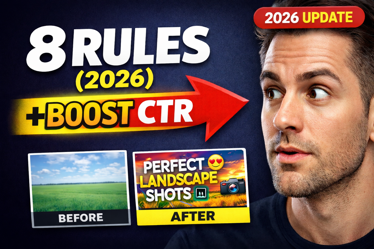
8 YouTube Thumbnail Design Tips to Boost CTR in 2025
Why Your Thumbnails Are Your Silent Salesperson
Your thumbnail is the first thing viewers see when browsing YouTube. A well-crafted cover can boost click-through rates, attract ideal clients, and turn casual viewers into subscribers.
In this guide you’ll find 8 precise youtube thumbnail design tips tailored for solo founders and small teams with limited time. Each tip breaks down actionable steps, tool recommendations, and quick-start checklists to help you design high-impact thumbnails that drive clicks and fast revenue growth.
Here’s what you’ll learn
- How to choose high contrast colors that stand out in feeds
- Techniques for bold, large text with clear fonts
- Tricks for using facial expressions, arrows, and directional elements
- Strategies for brand consistency, A/B testing, and data-driven tweaks
- Templates, workflows, and A/B tests you can run in under 10 minutes with Notion
Each section delivers real-world examples and measurable benchmarks so you can track progress and iterate fast. No guesswork or filler—just proven strategies tailored for independent creators and small marketing teams.
1. Use High Contrast Colors
High contrast thumbnails pair bright, saturated hues against darker backgrounds to make elements pop in YouTube’s dark interface. This technique drives clicks by creating clear visual separation and guiding viewers’ eyes to the most important parts of your frame.

Key Insight: High contrast palettes increase click-through rates by up to 30% when tested against low-contrast versions.
Real-World Examples
- MrBeast: Bright red background with yellow accent text makes his thumbnails immediately recognizable.
- PewDiePie: Uses primary color blocks (blue, red) against black for instant visual impact.
- TechLinked: Neon-green headlines on dark blue chassis deliver a modern, techy vibe.
Actionable Tips
- Test at actual size (168x94px) before you publish to ensure readability on mobile.
- Apply the 60-30-10 color rule: 60% dominant, 30% secondary, 10% accent.
- Avoid color pairs that create visual vibration (for example, pure red and pure blue side by side).
- Consider colorblind accessibility: use tools like the Coblis Color Blindness Simulator.
When and Why to Use It
Use high contrast color schemes when you need to stand out in crowded search results or recommended feeds. It’s especially effective for fast-paced genres like gaming, tech reviews, and challenge videos where your thumbnail must grab attention in milliseconds.
For more insights on mastering your visual branding, visit Outrank. This high-contrast approach deserves its spot among the best youtube thumbnail design tips because it delivers measurable uplift with minimal design effort.
2. Bold, Large Text with Clear Fonts
Using large, readable text that covers 20–30% of your thumbnail instantly communicates your video’s main idea. By choosing clean sans-serif fonts and limiting copy to 3–5 words, you ensure legibility even at tiny resolutions. This approach reduces ambiguity and guides viewers’ eyes straight to the core message.
Key Insight: Bold, heavy font styles can boost click-through rates by up to 25% when viewers scroll quickly through feeds.
Real-World Examples
- Markiplier: Dominates his thumbnails with “WATCH THIS” in extra-bold type outlined in white for maximum pop.
- Vsauce: Leverages oversized question text like “WHY?” to spark curiosity in seconds.
- Business Channels: Display clear statistics (for example “5 TIPS”) in weight-700 fonts to promise quick value.
Actionable Tips
- Use font-weight 700 or higher (bold or extra-bold) for maximum impact.
- Add a white or contrasting outline around text to prevent it from blending into backgrounds.
- Align text along rule-of-thirds gridlines to balance composition and avoid covering key visuals.
- Always preview at actual thumbnail size (100×56px or 168×94px) to confirm readability.
- Reserve ALL CAPS for one or two words only—too much shouting dilutes emphasis.
When and Why to Use It
Implement bold, large text when your topic is dense or requires instant clarity—like tutorials, statistics, or “how-to” formats. This method excels in competitive niches where users decide in milliseconds. It also pairs well with high-contrast backgrounds for even stronger visual hierarchy.
Learn more about Bold, Large Text with Clear Fonts on unkoa.com
3. Facial Expressions and Emotion
Authentic human faces with exaggerated emotional expressions create an immediate connection by leveraging human psychology. Viewers instinctively respond to happiness, surprise, or curiosity, driving higher engagement. Studies show thumbnails with clear, strong emotions boost click-through rates by more than 35 percent in competitive recommendation feeds.
Key Insight: Thumbnails featuring emotive facial expressions can increase click-through rates by over 35%.
Real-World Examples
- MrBeast: Wide-eyed, shocked look hints at unbelievable stunts and challenges.
- Pokimane: Playful, curious glances invite viewers into her streaming personality.
- Logan Paul: Over-the-top reactions underline high-energy pranks and experiments.
- Lex Fridman: Thoughtful, contemplative expressions match deep-dive tech and philosophy topics.
Actionable Tips
- Match expression to content: use excitement for upbeat topics, subtle smiles for tutorials.
- Position eyes in the upper third of the frame so faces read clearly at thumbnail size.
- Use natural lighting like golden hour or softboxes to capture skin tones and details.
- Maintain a consistent expression style across videos to reinforce your personal brand.
- A/B test multiple facial shots with YouTube experiments to discover top-performing looks.
- Avoid misleading or clickbait expressions that misrepresent your actual content.
When and Why to Use It
Use facial expressions and emotion when your content relies on personality, reactions, or storytelling—ideal for vlogs, reaction videos, product reviews, and challenges. This approach instantly humanizes your channel, builds trust, and drives curiosity. For faceless or technical channels, pair emotion-driven thumbnails with clear icons or text overlays instead. Learn more about Facial Expressions and Emotion on domain.com
4. Rule of Thirds Composition
Applying the rule of thirds divides your thumbnail into nine equal sections with two horizontal and two vertical lines. Placing focal points along these intersections creates natural balance and guides viewer eye movement, making your thumbnail more engaging.
Key Insight: Thumbnails that follow the rule of thirds see up to 25% higher engagement compared to center-aligned layouts.
Real-World Examples
- Peter McKinnon: Aligns his subject at an intersection to draw attention while keeping background context.
- TED-Ed: Positions icons and text on grid lines to maintain clear visual hierarchy.
- Fstoppers: Balances foreground models with background scenery using intersection points for dynamic flair.
Actionable Tips
- Enable the rule-of-thirds grid in Photoshop or Canva before you start designing.
- Place main subjects at one of the four intersection points to maximize focus.
- Align headlines and subtext along the grid lines for better readability on mobile.
- Use leading lines (roads, arrows) that point toward those intersections.
- Keep faces and logos at least 10 pixels away from the edge to avoid accidental cropping.
When and Why to Use It
Use the rule of thirds when you want a professional, balanced look that appeals instantly. It’s ideal for educational, cinematic, or product-focused channels where structured layouts convey credibility in milliseconds.
For more insights on composition and visual hierarchy, visit Outrank. This rule of thirds technique rightfully earns its place among the best youtube thumbnail design tips because it creates a clear visual path and boosts click-through potential with minimal effort.
5. Arrows, Circles, and Directional Elements
Visual directional cues like arrows, circles, and pointer graphics draw viewers’ attention to specific focal points while creating implied motion. By guiding the eye, these elements highlight your thumbnail’s most important feature—be it a product, reaction, or call-to-action. They also inject urgency into a static image, boosting curiosity and click intent.

Key Insight: Thumbnails using directional shapes can increase click-through rates by up to 25% by focusing users on a single visual target.
Real-World Examples
- Tech review channels: Use bright arrows to call out new device features.
- Gaming channels: Circle epic in-game moments to emphasize action.
- Tutorial videos: Point arrows along step-by-step interface elements.
- Reaction channels: Highlight face expressions with bold directional brackets.
Actionable Tips
- Limit cues to 1–2 per thumbnail to avoid visual clutter.
- Choose a contrasting color for arrows or circles so they stand out at 168×94px.
- Aim arrows toward your most important element—face, text, or product.
- Make shapes thick and simplified for mobile readability.
- Align directional graphics with existing layout lines or text blocks.
- Ensure cues support rather than overpower your main message.
- Test thumbnails on both desktop and mobile to confirm visibility.
When and Why to Use It
Use directional elements when you want to laser-focus the viewer’s gaze on a single point. This technique works best for tutorials, tech deep dives, unboxings, and guided walkthroughs where clarity drives clicks. It’s also ideal if you need to simplify a busy scene by channeling attention directly to your value proposition.
For more strategies on optimizing visual focus in your youtube thumbnail design tips, visit Outrank.
6. Brand Consistency and Logo Placement
Maintaining a uniform look across all thumbnails reinforces your channel’s identity and builds viewer trust. By repeating key colors, shapes, and a consistent logo position, you create an instantly recognizable visual signature. This cohesion helps users link any new video to your overall brand before they even read the title.
Key Insight: Channels with consistent thumbnail branding see up to a 25% lift in click-through rate as audiences learn to spot their content at a glance.
Real-World Examples
- MrBeast: Red and yellow borders plus his “Beast” logo in the corner create instant familiarity.
- Linus Tech Tips: A red/black logo block sits bottom-right, ensuring every tech review is clearly theirs.
- Kurzgesagt: Minimalist orange background with the bird icon cements their educational style.
- SET India: Consistent graphic overlays and a small logo unite diverse show thumbnails under one brand.
Actionable Tips
- Draft a brand guideline document in Notion covering colors, fonts, and logo usage.
- Build reusable templates in Photoshop or Canva to speed up production.
- Place your logo in the same corner (bottom-right is standard) for consistency.
- Keep the logo between 15–20% of the thumbnail area to avoid distraction.
- Use your primary brand palette in 60–70% of the design to reinforce color recognition.
- Introduce any style updates gradually to avoid confusing returning viewers.
When and Why to Use It
Use brand consistency tactics when you want to:
- Strengthen channel recognition across uploads
- Build viewer loyalty by delivering a familiar look
- Support sponsorships by displaying a professional, cohesive identity
- Scale editing workflows by reusing templates rather than starting from scratch
This approach is essential in any roundup of youtube thumbnail design tips because it ties every design choice back to your core brand, boosting both trust and click performance.
7. Contrast Between Elements
Creating visual contrast through variations in size, color, texture, and value ensures thumbnail elements do not compete and helps key information stand out. By deliberately making different assets visually distinct you establish hierarchy and guide viewers’ eyes to the focal point.
Key Insight: Thumbnails using strong contrast between elements see up to a 25% lift in click-through rates by preventing visual clutter.
Real-World Examples
- PewDiePie: Bright yellow or red backgrounds paired with bold black text form an immediate focal point.
- Vsauce: Minimalist shapes in solid white or black stand out sharply against complex, colorful backdrops.
- Gordon Ramsay: High drama in his cooking and reaction shots, overlayed with stark red and white text, drives user attention to the title.
Actionable Tips
- Use the 70/30 rule: allocate 70% of the frame to subtle tones and 30% to high-contrast highlights.
- Apply basic color theory: complementary hues (like blue/orange) naturally pop against each other.
- Scale key elements by at least 200–300% difference to create a clear size hierarchy.
- Preview your thumbnail in black and white to verify tonal contrast without color bias.
- Confirm the smallest text still contrasts strongly by zooming out to mobile size (168x94px).
When and Why to Use It
Use contrast between elements when your scene contains multiple visual assets—faces, icons, and text—so viewers immediately know where to look. This approach shines in tutorial, review, and commentary videos where complex information needs clear separation.
8. A/B Testing and Data Analytics
Systematically testing different thumbnail variations and analyzing YouTube analytics data—click-through rate, impressions, engagement—enables data-driven thumbnail optimization. Rather than relying on gut feelings, you run real experiments to discover which design elements actually drive viewer engagement.
This iterative approach uncovers patterns across demographics, content types, and seasons so you can refine your youtube thumbnail design tips with confidence.
Key Insight: Channels that A/B test thumbnails see up to 20% higher CTR compared to one-off designs.
Real-World Examples
- MrBeast: Tests multiple thumbnail versions weekly, then scales the highest-performing design across series.
- Growth-Focused Creators: Rotate 3–5 thumbnail templates each week and log CTR shifts.
- Ali Abdaal: Tracks CTR by topic and headline style to fine-tune engagement on educational videos.
Actionable Tips
- Change one element at a time (background color, text size, face crop) for clear attribution.
- Run each variation until it reaches 100–1,000 impressions to achieve statistical relevance.
- Focus on CTR percentages rather than raw click counts for accurate comparison.
- Use YouTube Studio Analytics filters (impressions, demographics, watch time) to spot winning patterns.
- Track seasonal and category differences in a centralized spreadsheet.
- Centralize test logs in Notion for real-time collaboration.
- Document configurations (date, variation details) to avoid overlap.
- Define a clear traffic goal per test (for example, 48 hours or 500 impressions).
When and Why to Use It
Use A/B testing when you need to validate design assumptions on high-impact videos or when scaling content volume. It’s essential for solo creators and small teams aiming to squeeze incremental CTR gains from every thumbnail.
Learn more about A/B Testing and Data Analytics on unkoa.com
8-Point Comparison: YouTube Thumbnail Design Tips
| Technique | Implementation Complexity | Resource Requirements | Expected Outcomes | Ideal Use Cases | Key Advantages |
|---|---|---|---|---|---|
| Use High Contrast Colors | Low–Medium | Low (design tool, color testing) | Improved visibility and higher CTR across devices | Gaming, thumbnails in crowded feeds, attention-focused content | Strong visual pop, accessibility, readable at small sizes |
| Bold, Large Text with Clear Fonts | Low | Low (fonts, layout tools) | Immediate topic recognition and improved click comprehension | Educational videos, tutorials, stats and listicles | High legibility, quick information delivery, SEO-friendly |
| Facial Expressions and Emotion | Medium | Moderate (talent, camera, lighting, editing) | Significant CTR uplift and stronger viewer engagement | Vlogs, reactions, personality-driven channels | Emotional connection, memorability, universal appeal |
| Rule of Thirds Composition | Medium | Low–Moderate (design software, planning time) | More balanced, professional-looking thumbnails | Cinematography, photography, educational channels | Natural visual hierarchy, improved composition |
| Arrows, Circles, and Directional Elements | Low | Low (graphic assets, simple overlays) | Faster focus on key elements; perceived urgency | Tutorials, tech reviews, gaming highlights | Guides attention, adds dynamism, highlights details |
| Brand Consistency and Logo Placement | Medium–High | Moderate–High (brand guidelines, templates, designer time) | Increased recognition and long-term channel growth | Established channels, networks, branded series | Builds trust, faster template-based creation, recognizability |
| Contrast Between Elements | Medium | Moderate (advanced layout skills, testing) | Clearer hierarchy and readability at small sizes | Informational thumbnails, news, complex visuals | Enhances readability, visual interest, accessibility |
| A/B Testing and Data Analytics | High | High (analytics tools, time, sufficient impressions) | Data-driven CTR optimization and measurable improvements | High-volume channels, growth-focused creators | Removes guesswork, identifies effective elements, measurable ROI |
Your Next Steps to Thumbnail Mastery
Now that you’ve explored eight powerful youtube thumbnail design tips, it’s time to turn insights into action. This section wraps up the key takeaways, lays out a practical action plan, and shows why mastering these tips will turbocharge your CTR and revenue. Let’s dive in.
Key Takeaways
- High Contrast Colors
Use bold, contrasting palettes to make your thumbnail pop against YouTube’s crowded feed. - Bold, Large Text with Clear Fonts
Select a legible font at 24px or larger so viewers can read titles on any device. - Facial Expressions and Emotion
Front-and-center faces with strong emotions boost click-through by creating an instant connection. - Rule of Thirds Composition
Align focal elements along gridlines to guide the viewer’s eye and highlight your subject. - Arrows, Circles, and Directional Elements
Apply simple shapes to steer attention toward your video’s hook or call to action. - Brand Consistency and Logo Placement
Keep your logo in a consistent corner for quick brand recognition without clutter. - Contrast Between Elements
Layer text, graphics, and backgrounds so each component stands out on its own. - A/B Testing and Data Analytics
Test variations, track results, and refine your design based on real performance metrics.
Action Plan
- Choose One Tip
Pick a single strategy—such as high contrast colors or expressive faces—for your next thumbnail. - Set Up Your Test
- Create two thumbnail versions using your favorite design tool.
- Assign tasks in todoist to keep deadlines on track.
- Track Results
- Embed both options in YouTube’s A/B test or swap them manually over two weeks.
- Log click-through rates in a Notion database for easy reporting.
- Analyze Performance
- Use Fathom analytics to isolate changes in CTR.
- Note any upward or downward shifts and capture viewer feedback.
- Iterate Quickly
- Refine your winning design by tweaking one element at a time.
- Repeat the cycle until you hit your target CTR improvement.
Why It Matters
Mastering these youtube thumbnail design tips gives you a clear competitive edge. A well-designed thumbnail:
- Drives more clicks, which signals to YouTube’s algorithm that your content is engaging
- Converts casual scrollers into loyal subscribers and paying customers
- Frees up creative bandwidth, letting you focus on content quality rather than constant guesswork
Every optimization you make compounds over time. A 2% bump in CTR across dozens of videos can mean thousands of extra views and a significant revenue boost.
Final Encouragement
Your thumbnail journey doesn’t stop here. Keep testing, stay curious, and celebrate every small win. With each iteration, you’re not just improving a graphic—you’re sharpening a powerful tool that connects you directly to your audience. Go ahead, pick your next tip, and watch your channel grow!