7 Best SaaS Pricing Page Examples to Inspire You in 2025
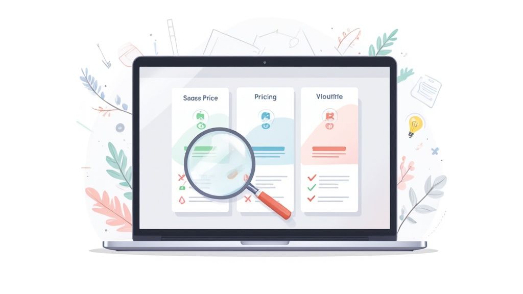
Your SaaS pricing page is your most important salesperson. It works 24/7, handles every lead, and can make or break a conversion. Yet, it's often the most challenging page to design. How do you clearly communicate value, justify your price, and guide users to the right plan without causing confusion or friction? The answer isn't to guess; it's to learn from the best.
This comprehensive listicle breaks down high-performing SaaS pricing page examples to give you a strategic blueprint for your own. We won't just show you pretty designs. Instead, we'll deconstruct the specific conversion psychology, UX patterns, and pricing architectures that make these pages work. You will get an inside look at how successful companies structure their tiers, highlight their value propositions, and use subtle design cues to drive sign-ups.
Inside, you’ll find annotated screenshots and actionable takeaways for each example, so you can see exactly what to replicate. We’ve analyzed pages from top-tier companies, uncovering replicable strategies you can implement immediately. For those ready to build or test, we'll highlight how tools like Webflow are perfect for showcasing, cloning, or quickly building pricing pages with toggles, comparison tables, and responsive layouts. Platforms like Unbounce are ideal for A/B testing pricing tables, CTAs, and copy so you can take these examples and validate what actually converts. This guide is your shortcut to a pricing page that doesn't just list prices, it actively sells your product and converts visitors into paying customers.
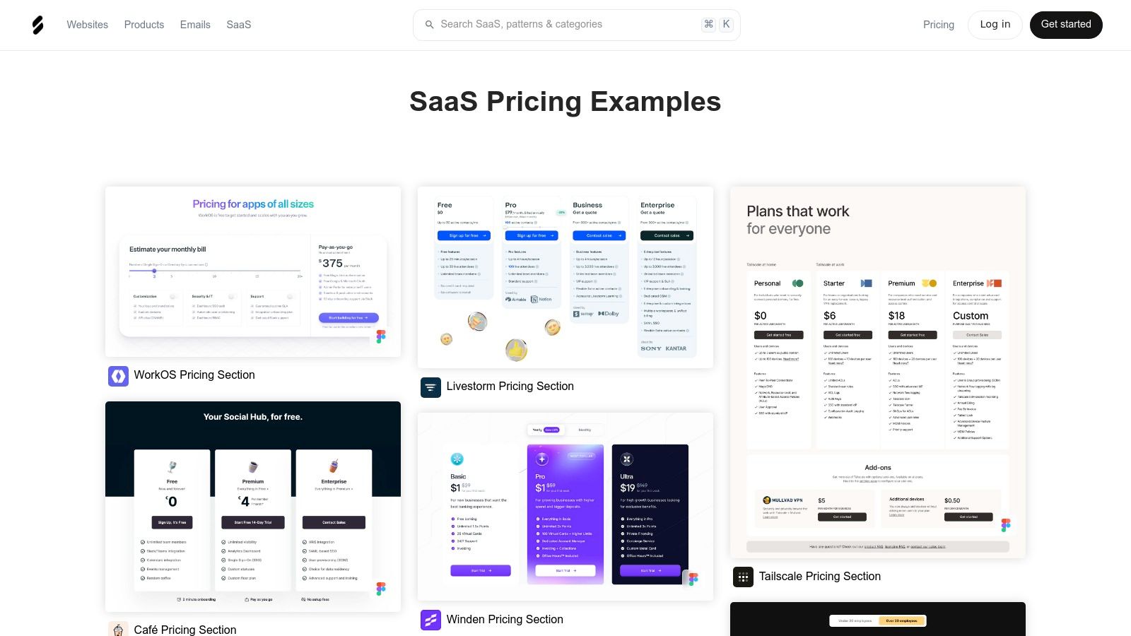
1. DivByZero – The Comprehensive Visual Library
Before you start building or redesigning, the first step is always research. DivByZero is a purpose-built platform that strips away the noise, offering a focused, high-quality gallery dedicated exclusively to SaaS pricing page examples. It’s the perfect starting point to gather visual inspiration and understand current design trends without endlessly searching on Google.
The platform’s strength lies in its simplicity and laser focus. While other design inspiration sites cover entire websites, DivByZero curates only pricing pages, saving you countless hours. The interface is clean and minimalist, allowing you to quickly scan hundreds of real-world examples from a diverse range of SaaS companies, from early-stage startups to established industry leaders.
Key Features and Strategic Value
DivByZero is more than just a gallery; it's a strategic research tool. By studying its collection, you can quickly identify common patterns, unique value propositions, and effective user interface (UI) designs.
- Pattern Recognition: Easily spot trends like the use of annual vs. monthly toggles, feature comparison tables, and the "most popular" plan highlight.
- Copywriting Inspiration: Analyze how different companies articulate their features, frame their value, and write compelling calls-to-action (CTAs).
- Design and UX Insights: Observe how color, layout, and whitespace are used to guide the user's eye and reduce cognitive load.
Strategic Takeaway: Use DivByZero as your initial mood board. Before you write a single line of code or design a pixel, spend 30 minutes scrolling through the examples. Screenshot 5-10 pages that resonate with your brand and target audience to create a solid foundation for your own design.
How to Use DivByZero Effectively
To get the most out of the platform, approach it with a specific goal. Don't just browse aimlessly.
- Filter and Search: Look for examples within your specific niche (e.g., "project management" or "email marketing") to see how direct competitors handle pricing.
- Analyze Structure: Pay attention to the order of information. What comes first? The plans, the FAQ, or the social proof?
- Deconstruct the Offer: For each example you like, break down how they present their value. Are features listed in bullet points? Is there a checkmark-based comparison grid?
Once you have your inspiration, you can use a tool like Webflow to quickly build a visually similar layout or leverage a landing page builder like Unbounce to A/B test different elements you've discovered. Access to DivByZero requires a quick, free signup.
Website: divbyzero.co
2. SaaSFrame – The UX-Focused Pattern Library
If DivByZero is your visual mood board, SaaSFrame is your UX blueprint. This platform goes beyond static screenshots, offering a curated design library of SaaS pages, screens, and user flows. Its dedicated pricing section is invaluable for teams focused on the user experience, providing both desktop and mobile variants to ensure your design is effective on any device.
SaaSFrame’s unique advantage is its pattern-based organization and depth. Instead of just showing you a final pricing page, it breaks down the components and even provides access to Figma source files (with a Pro plan). This makes it an incredibly powerful tool for designers and product managers who want to deconstruct and rebuild effective saas pricing page examples from the ground up, rather than just copying surface-level aesthetics.
Key Features and Strategic Value
SaaSFrame bridges the gap between inspiration and implementation. It’s built for teams that need to understand not just what a pricing page looks like, but how it functions as part of a larger user journey.
- Mobile and Desktop Views: Easily compare how pricing tables and feature lists adapt to different screen sizes, a critical step often overlooked in early design phases.
- Figma Source Files: Pro users can download assets directly into their design workflow, saving hundreds of hours recreating components and layouts.
- Full User Flow Context: See how pricing pages connect with other parts of the user experience, like signup forms and checkout flows, for a more holistic design approach.
Strategic Takeaway: Use SaaSFrame to go beyond visual imitation and start thinking in terms of user experience patterns. Analyze how mobile and desktop layouts differ and identify which components (like FAQs or feature grids) are essential for your audience. The mobile view is especially critical, as many B2B buyers now research on their phones.
How to Use SaaSFrame Effectively
To maximize SaaSFrame's value, focus on its UX and implementation features. The goal is to build a functional, responsive pricing page, not just a pretty picture.
- Filter for Mobile First: Start your research by only looking at mobile variants of pricing pages. This forces you to prioritize the most critical information and CTAs.
- Deconstruct with Figma: If you have a Pro account, download the Figma file for a design you admire. Break it apart to understand its spacing, typography, and component structure.
- Map the Flow: Don't just look at the pricing screen in isolation. Use SaaSFrame’s library to see how users arrive at the pricing page and what happens after they click a CTA.
After analyzing the structure in SaaSFrame, you can use a tool like Webflow to build a high-fidelity, fully responsive prototype. For validating specific elements like a headline or CTA button, an A/B testing platform like Unbounce is perfect for quickly testing variations you've discovered. While many examples are free to view, the most valuable assets require a Pro subscription.
Website: saasframe.io/patterns/pricing
3. Landing Gallery – The Frictionless Inspiration Hub
For those who need visual inspiration without the friction of sign-ups or complex filters, Landing Gallery provides a streamlined and immediately accessible collection of design patterns. Its dedicated pricing page category is a well-curated library perfect for rapid idea generation and layout analysis. It serves as an excellent resource for seeing how established companies structure their offers.
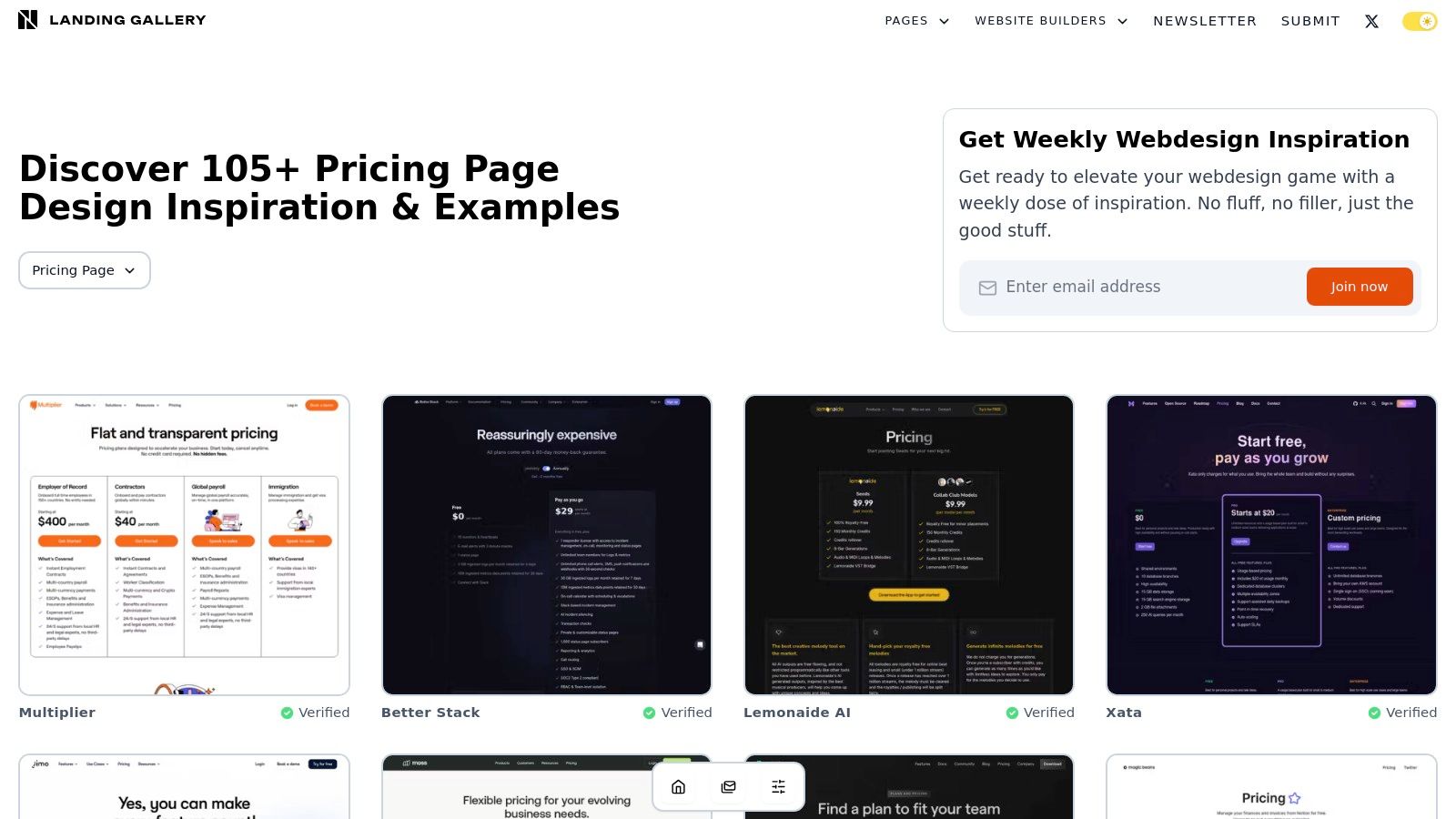
The platform’s core value is speed and accessibility. Unlike members-only galleries, Landing Gallery is open to everyone, allowing you to dive straight into its collection of over 100 SaaS pricing page examples. The 'load more' browsing feature creates an endless scroll experience, making it easy to quickly scan dozens of designs to identify visual themes, tiering strategies, and comparison table layouts in just a few minutes.
Key Features and Strategic Value
Landing Gallery excels as a quick-reference tool for visual problem-solving. When you're stuck on how to present a feature or structure a plan, a fast scroll through its examples can unlock new ideas and provide proven solutions from successful products.
- Zero-Barrier Access: No login or signup is required, making it one of the fastest ways to start your research and find pricing page examples.
- Focused Curation: The dedicated pricing page category ensures you only see relevant examples, saving you from sorting through irrelevant landing pages.
- Layout and Tiering Analysis: Excellent for studying the "shape" of a pricing page. You can quickly see whether companies prefer three, four, or even five-tier structures and how they use visual hierarchy.
- Direct Source Linking: Most examples link directly to the live page, allowing you to see the design in its natural habitat and explore its interactive elements.
Strategic Takeaway: Use Landing Gallery when you have a specific UI question, like "How do other SaaS companies design their feature comparison tables?" or "What are common ways to display an enterprise plan CTA?" Its visual-first approach provides instant answers to these common design challenges.
How to Use Landing Gallery Effectively
To maximize your time on Landing Gallery, use it as a targeted solution-finding tool rather than a general browsing site.
- Scan for Structure: Open the pricing category and scroll quickly, paying attention only to the number of tiers and the overall page layout. Note which structures feel the clearest.
- Focus on Comparison Grids: Look specifically at how features are listed and compared. Are they grouped by category? Do they use icons or just text? How do they handle features exclusive to higher-tier plans?
- Analyze the CTA Hierarchy: Observe the primary call-to-action on each plan. Note the color, copy, and placement used to draw attention to the preferred or "most popular" option.
After gathering your visual ideas, you can translate them into a functional design. A platform like Webflow is perfect for building custom layouts and interactive elements you've seen, while a tool like Unbounce lets you quickly A/B test different CTA copy and button colors inspired by the gallery's examples.
Website: landing.gallery/inspiration/pricing
4. SaaS Interface – Pricing Design Examples
If your goal is quick, high-fidelity visual inspiration from established brands, SaaS Interface is an excellent resource. It serves as a design-focused gallery, curating a clean, easy-to-browse collection of real-world saas pricing page examples. Its value comes from its focus on recognizable companies, providing a benchmark against what successful, well-funded teams are implementing.
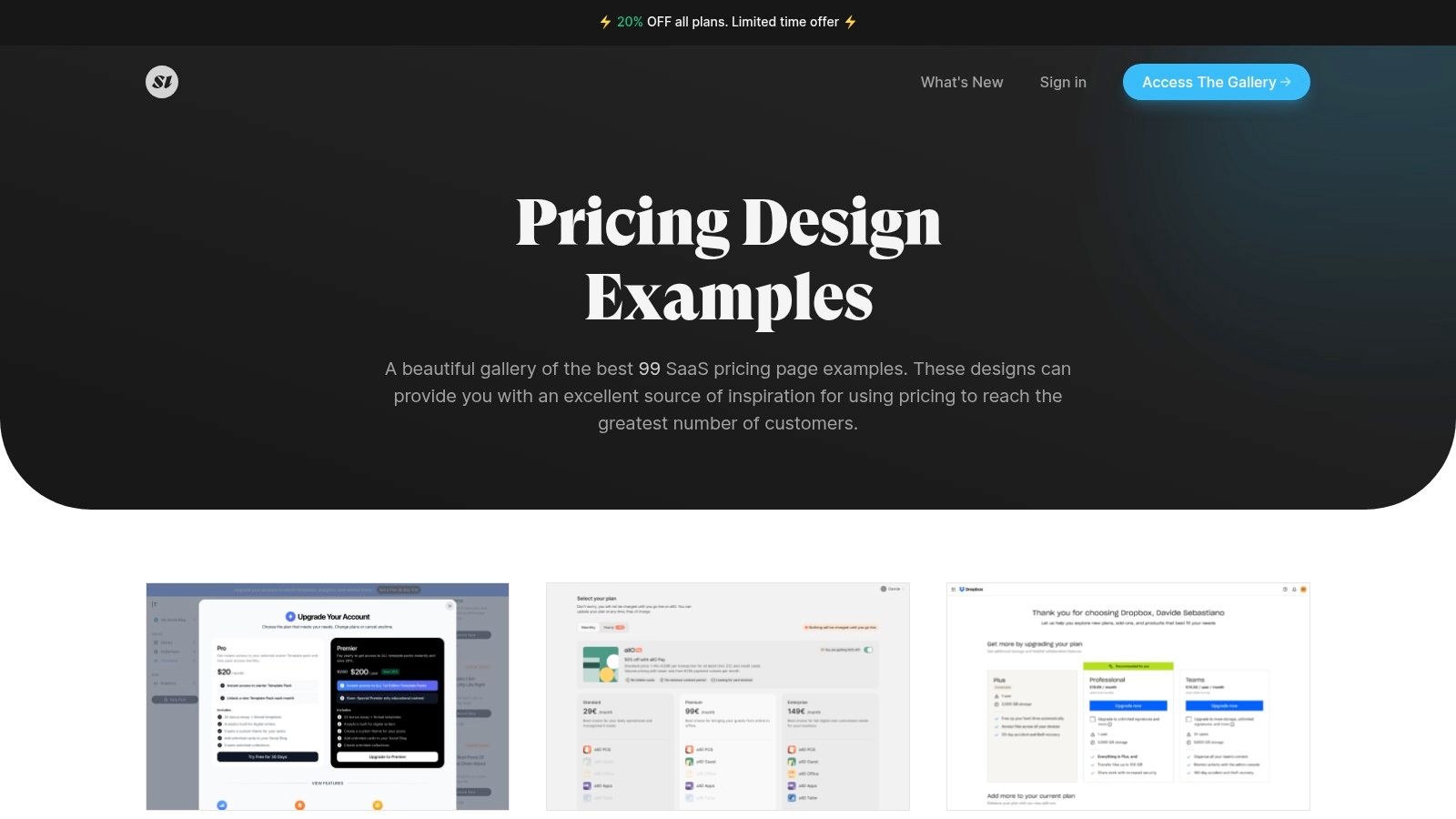
Unlike platforms that offer deep analytical breakdowns, SaaS Interface is built for speed and aesthetic comparison. Its minimalist layout allows you to quickly scroll through dozens of examples from well-known brands like Notion, Slack, and Figma. This makes it an ideal tool for designers and founders looking to understand the current visual language of SaaS pricing without getting bogged down in extensive text. The collection is regularly updated, sometimes noting promotions or discounts offered by the featured companies.
Key Features and Strategic Value
SaaS Interface excels as a visual benchmarking tool, helping you align your design with established industry standards and user expectations. By studying its collection, you can absorb proven layouts and UI patterns from market leaders.
- Credible Benchmarking: See how top-tier companies like Xero and Asana structure their tiers, name their plans, and visually distinguish their offerings.
- Design-Forward Inspiration: The gallery is purely visual, making it perfect for UI/UX designers seeking ideas for color palettes, typography, and card-based layouts.
- Efficient Browsing: The simple, grid-based interface is designed for rapid scanning, helping you gather multiple ideas in just a few minutes.
Strategic Takeaway: Use SaaS Interface to validate your design direction against the best in the business. Before finalizing your layout, compare it to 3-5 examples from top companies in your vertical. Ask yourself: "Does my page look as professional and trustworthy as these?"
How to Use SaaS Interface Effectively
To maximize the value of this resource, use it as a targeted visual reference rather than an all-encompassing research tool.
- Look for Layout Patterns: Don't just look at the colors. Analyze the structure. How many columns are used? Where is the FAQ section placed? Is there a feature comparison table below the main plans?
- Study Visual Hierarchy: Pay close attention to how leading brands use size, color, and labels (e.g., "Most Popular") to guide users toward a specific plan.
- Benchmark Against Leaders: Search for major players in your industry. Seeing how they present their pricing can reveal customer expectations you need to meet.
Once you’ve gathered your visual inspiration, you can use a no-code tool like Webflow to build a sophisticated, responsive pricing page based on these proven designs. For testing specific elements you’ve identified, a landing page builder like Unbounce is perfect for A/B testing different CTAs or plan highlights to see what converts best. Access to SaaS Interface is free and requires no signup.
Website: saasinterface.com/pages/pricing/
5. SaaS Websites – Pricing-page inspiration (with filters/tags)
When you move beyond general inspiration and need to find saas pricing page examples that use specific elements, SaaS Websites becomes an invaluable resource. This curated gallery lets you filter and search for pricing pages based on the components they contain, such as toggles, feature tables, or even social proof like customer logos. It's the ideal tool for deconstructing how top-tier companies build trust and communicate value.
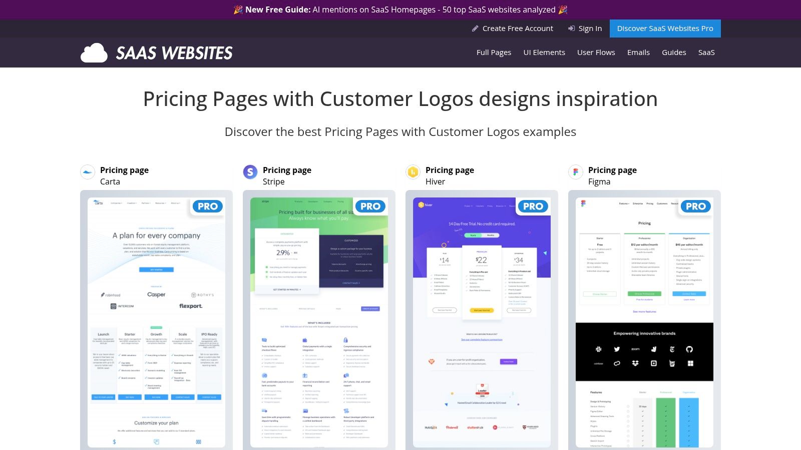
Unlike a simple visual gallery, SaaS Websites functions more like a searchable database of design patterns. If you're wondering how market leaders like Stripe, Figma, or Airtable implement a specific feature, you can quickly find it here. This tag-based discovery saves you from manually visiting dozens of sites, allowing you to focus your research on proven UI and UX patterns from credible, successful companies.
Key Features and Strategic Value
The main advantage of SaaS Websites is its granular, tag-based filtering system. This allows you to reverse-engineer pricing pages by focusing on the individual components that drive conversions.
- Component-Specific Search: Find examples that include specific elements you want to implement, like "customer logos," "feature comparison grids," or "annual discount toggles."
- Top-Tier Benchmarking: The collection is heavily focused on well-known and respected SaaS brands, providing a reliable benchmark for best practices.
- UI Pattern Discovery: Quickly identify how different companies solve the same design challenge, helping you choose the most effective approach for your audience.
Strategic Takeaway: Use SaaS Websites to validate your design choices. If you’re considering adding a specific element like a "Contact Us" block for enterprise plans, search for that tag. Analyze how 5-10 leading companies execute it to create a solution based on proven industry standards.
How to Use SaaS Websites Effectively
To maximize its value, use the platform’s filters to answer specific design questions rather than for general browsing.
- Define Your Element: Start with a component you want to improve. For example, "How can I better display social proof on my pricing page?"
- Apply Relevant Tags: Use the tag-based navigation to filter for pages with "customer logos" or "testimonials."
- Analyze the Implementation: Study how and where these elements are placed. Are logos above the plans? Are testimonials paired with specific tiers? Note the placement, size, and accompanying copy.
Once you’ve identified a pattern you want to replicate, you can use a no-code tool like Webflow to build a high-fidelity version for your own site. For testing the impact of these new elements on conversions, a landing page builder like Unbounce is perfect for setting up A/B tests. The site is free to browse, with a Pro account unlocking additional features and content.
Website: saaswebsites.com
6. Trickle – 50+ SaaS Pricing Page Examples collection
While dedicated galleries are great for broad inspiration, sometimes you need a curated, shareable collection to collaborate with your team. Trickle offers a focused set of 50+ SaaS pricing page examples from well-known companies like Postman, Segment, and Notion. It’s designed less for endless browsing and more for practical, collaborative research.
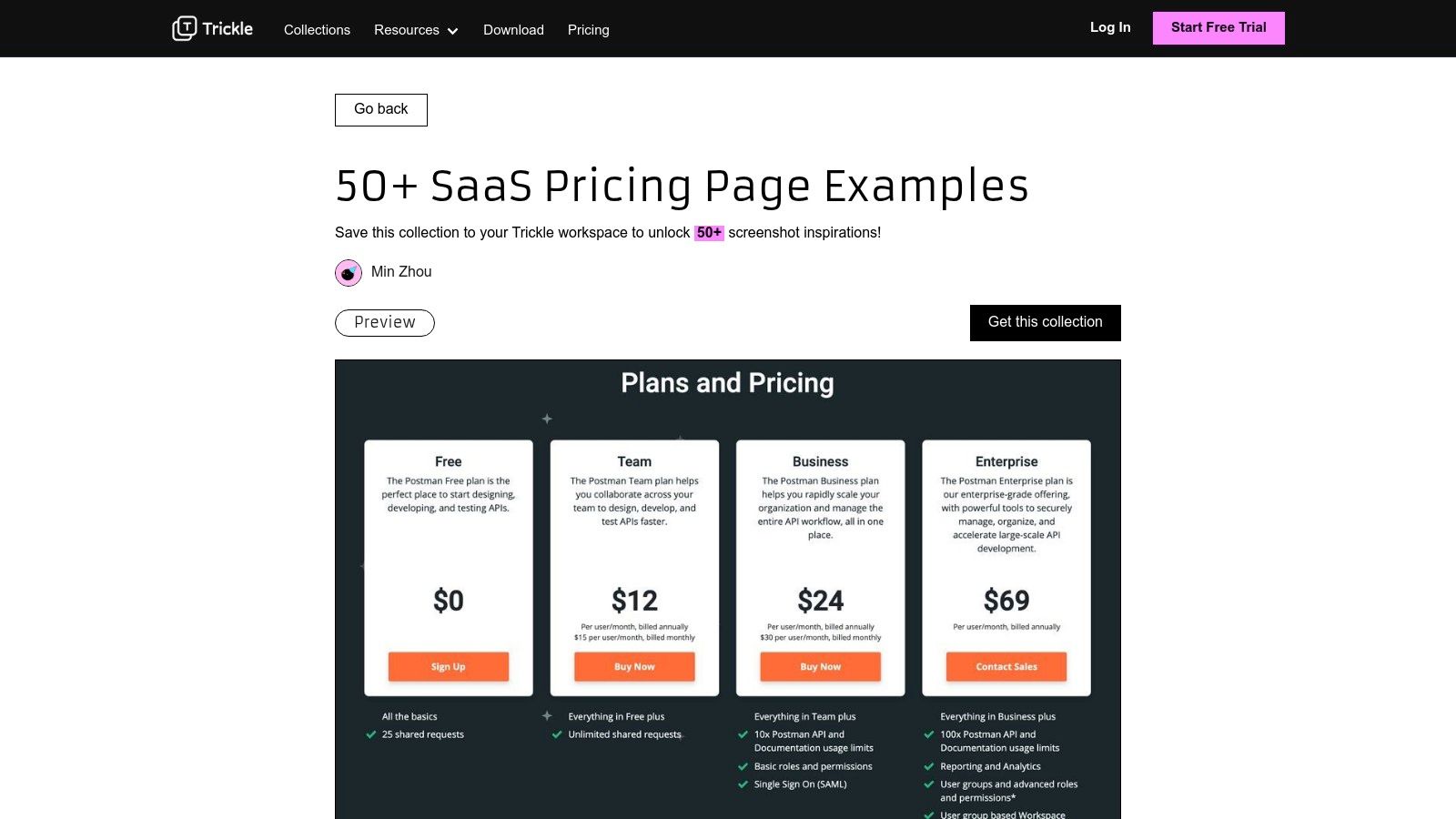
The platform’s core value lies in its "collection" format. Unlike a simple gallery, Trickle allows you to save these examples directly into a shared workspace. Each screenshot comes with a short caption summarizing the plan structure, making it easy to quickly grasp the strategy behind each page. This turns passive viewing into an active process of collecting, organizing, and discussing references with stakeholders.
Key Features and Strategic Value
Trickle is built for teams that need to align on design direction. It bridges the gap between individual research and group decision-making by creating a centralized hub for pricing page inspiration.
- Team-Oriented Workflow: Save examples directly to a Trickle workspace, creating a shared mood board for your design, marketing, and product teams.
- Concise Summaries: Each example includes a brief caption that highlights the core pricing model (e.g., "Usage-based," "Per-user tiers"), saving you time on initial analysis.
- High-Quality Examples: The collection features established B2B SaaS brands, providing a reliable look at what’s working for successful companies.
Strategic Takeaway: Use Trickle to build a "swipe file" for a specific project. Instead of emailing links or dropping screenshots in Slack, create a dedicated Trickle collection. This ensures everyone is referencing the same examples and keeps feedback organized in one place.
How to Use Trickle Effectively
To maximize Trickle's collaborative features, approach it as a project management tool for your design research.
- Create a Project Workspace: Before browsing, set up a new workspace in Trickle for your pricing page redesign.
- Curate and Annotate: As you review the 50+ examples, save the most relevant ones to your workspace. Use Trickle’s features to add your own notes about what you like or want to test.
- Share and Discuss: Invite team members to the workspace to review the curated examples. This creates a focused discussion around a pre-vetted list of high-quality references.
Once your team is aligned, you can use a no-code tool like Webflow to build a prototype based on your favorite designs, or use a landing page builder like Unbounce to A/B test different CTA placements you observed. While the collection is publicly viewable, saving and organizing requires a free Trickle account. The platform itself is an interesting example of how solo founders stack tiny SaaS products to build a business.
Website: screenshot.trickle.so/collections/50-saas-pricing-page-examples
7. Webflow Blog – 24 beautifully designed pricing page examples
Sometimes you need more than just a gallery of images; you need context. The Webflow Blog's editorial roundup offers exactly that, breaking down over 20 saas pricing page examples with insightful commentary. It’s an ideal resource when you want to understand the why behind a design, not just the what.
This article moves beyond simple screenshots by providing actionable takeaways and rationale for each example. The editors highlight specific elements like layout choices, CTA button treatments, and the psychological principles at play. This added layer of analysis helps you connect design patterns to conversion goals, making it a valuable educational tool for founders and marketers alike.
Key Features and Strategic Value
Unlike a raw image gallery, this blog post is a curated learning experience. It combines visual inspiration with practical, expert guidance, helping you make more informed design decisions for your own pricing page.
- Expert Commentary: Each example is accompanied by notes that explain what makes the design effective, from its information hierarchy to its use of social proof.
- Actionable Takeaways: The article is structured to provide clear, practical tips you can apply immediately to your own pricing strategy and design.
- Diverse Examples: It showcases a mix of well-known and emerging companies, offering a broad perspective on how different brands tackle pricing presentation.
Strategic Takeaway: Use this article to build a "best practices" checklist for your own page. As you read through the examples and commentary, note the recurring themes: clear value propositions, highlighted popular plans, and trust-building elements like testimonials or FAQs. This will help you create a page that is not only beautiful but also effective.
How to Use Webflow Blog Effectively
To maximize the value of this resource, read it with an analytical mindset. Think of it as a guided tour through high-converting pricing pages.
- Focus on the Rationale: Don't just look at the pictures. Read the commentary for each example to understand the strategic thinking behind the design choices.
- Identify Replicable Tactics: Look for specific techniques you can borrow, such as how a company frames its annual discount or uses icons to quickly communicate features.
- Cross-Reference with Your Goals: Compare the examples to your own business model. A usage-based pricing page will have different priorities than a standard three-tiered model. For a deeper look into how specific tools handle subscriptions, you can learn more about subscription options for various platforms.
After gathering insights, you can use a tool like Unbounce to A/B test different CTA copy or value propositions you discovered. This free-to-access article is a masterclass in combining visual inspiration with conversion-focused strategy.
Website: webflow.com/blog/pricing-page-examples
7 SaaS Pricing Page Examples Comparison
| Example | Implementation complexity | Resource requirements | Expected outcomes | Ideal use cases | Key advantages |
|---|---|---|---|---|---|
| DivByZero – SaaS Pricing Page Examples | Low — quick signup unlocks gallery | Minimal — free account required | Large set of pricing screenshots for benchmarking | Fast pricing-first visual research | Large, regularly updated pricing-focused collection |
| SaaSFrame – Pricing pattern library | Medium — some features behind Pro and Figma integration | Team tools (Figma), Pro subscription for assets | Downloadable design assets and desktop/mobile variants | UX teams building mocks, flows, and prototypes | Figma source files, pattern-based UX depth |
| Landing Gallery – Pricing Page inspiration hub | Very low — public access, no login | Minimal — fully public gallery | Rapid visual scanning of layouts and tiering | Quick inspiration without barriers | No-login access, clean pricing categorization |
| SaaS Interface – Pricing Design Examples | Very low — browseable gallery | Minimal | Visual inspiration and brand-based benchmarking | Quick checks against recognizable SaaS examples | Emphasis on well-known brands and design-focused collection |
| SaaS Websites – Pricing-page inspiration (with filters/tags) | Low — browseable, Pro unlocks extras | Minimal to medium (optional Pro) | Targeted examples showing specific UI elements or social proof | Finding pricing pages with particular components (logos, CTAs) | Tag-based discovery and top-tier brand examples |
| Trickle – 50+ SaaS Pricing Page Examples collection | Low–Medium — preview public, account to save/share | Trickle account for saving and workspace organization | Organized, shareable collections with captions | Team curation and shared research workflows | Saveable collections, short captions, workspace sharing |
| Webflow Blog – 24 beautifully designed pricing page examples | Very low — editorial article format | Minimal — free article with screenshots | Actionable takeaways, rationale, and best-practice tips | Learning design rationale and implementation recommendations | Editorial commentary with practical guidance and examples |
Your Action Plan: Turning Inspiration into a High-Converting Pricing Page
We’ve journeyed through an extensive gallery of high-performing saas pricing page examples, dissecting everything from psychological triggers to user experience patterns. You've seen how leaders like Notion, SocialBee, and Fathom strategically structure their offers, and you’re now armed with a library of actionable insights. But inspiration without implementation is just entertainment. It's time to translate these ideas into a powerful, revenue-generating asset for your own business.
The core lesson from these examples is that a pricing page is not a static menu; it's an active sales conversation. It must guide, persuade, and reassure. It needs to answer the visitor's primary question, "Which plan is right for me?" with absolute clarity. The most effective pages achieve this by balancing simplicity with sufficient detail, using social proof to build trust, and making the call-to-action an easy, confident next step.
Your Immediate Next Steps
Don't let analysis paralysis set in. The goal is to make tangible progress, not to build the "perfect" page on the first try. Here’s a simple, step-by-step plan to get you started.
- Revisit Your Core Value Metric: Before you touch any design elements, confirm your pricing is tied directly to the value your customers receive. Is it per user, per project, per feature, or usage-based? This is the foundation of your entire pricing strategy.
- Choose Your Pricing Model: Based on the examples we analyzed, select one or two models that best fit your product and audience. A tiered model is a safe start, but consider if a usage-based or feature-gated approach would better align with your customers' growth.
- Draft Your Feature Matrix: Create a simple spreadsheet listing all your features down one column and your proposed tiers (e.g., Free, Pro, Business) across the top. Check off which features belong in each plan. This exercise forces clarity and helps you justify price differences.
- Write Your "Who Is This For?" Copy: For each tier, write a single sentence describing the ideal customer. For example, "Perfect for freelancers and solo founders" or "Built for growing teams that need to collaborate." This humanizes your plans and helps prospects self-select.
Building and Testing Your New Page
Once you have the strategic framework, it's time to bring your vision to life and start learning what actually converts. Two tools are indispensable at this stage:
- For Design and Development: Instead of starting from a blank canvas, use a flexible platform like Webflow. It is perfect for showcasing, cloning, or quickly building pricing pages with toggles, comparison tables, and responsive layouts. Many of the polished saas pricing page examples you've seen can be replicated and customized in Webflow without writing a single line of code, saving you invaluable development time.
- For Conversion Optimization: A beautiful page is useless if it doesn't convert. This is where a dedicated landing page and A/B testing tool like Unbounce becomes critical. It is ideal for A/B testing pricing tables, CTAs, and copy so you can take the examples and validate what actually converts. Start with simple but powerful tests: What happens if you change the CTA button color? Does "Start Free Trial" outperform "Get Started"? Does highlighting a specific plan with a "Most Popular" badge increase its selection rate? Unbounce provides the data you need to make decisions based on evidence, not guesswork.
Your pricing page is a living document, a perpetual work in progress. The examples in this guide are your starting point, not your final destination. Take the principles of clarity, value alignment, and trust, and apply them to your unique offer. Build your first version, launch it, and commit to a cycle of testing and iteration. By doing so, you'll transform your pricing page from a simple list of options into your most powerful conversion engine. Now, go turn that inspiration into action.