10-Point conversion rate optimization checklist for 2025
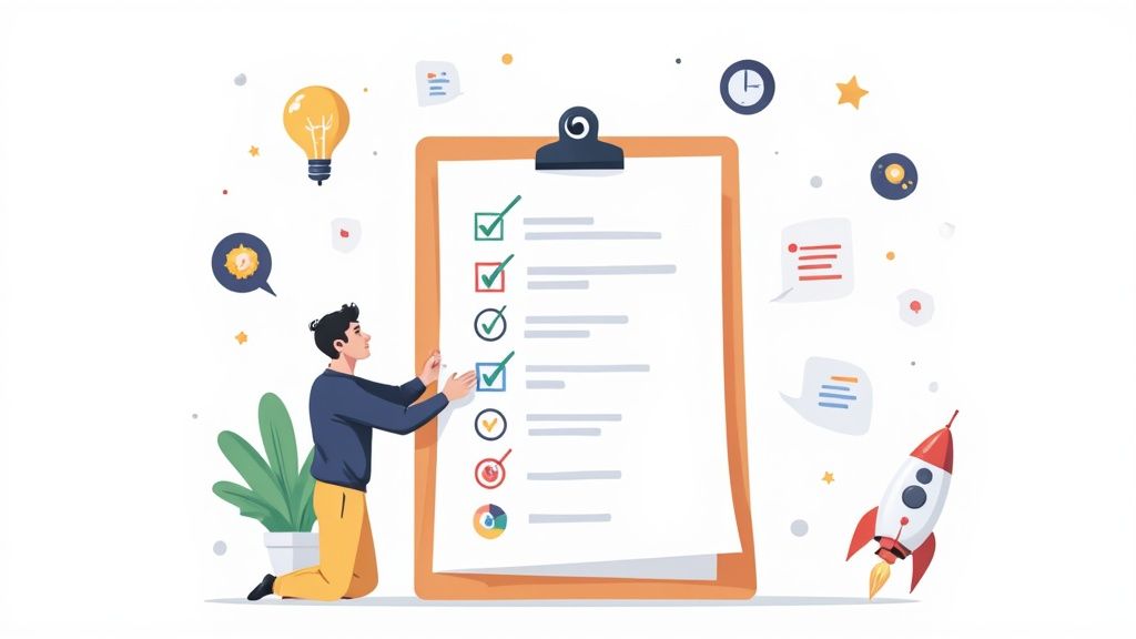
For solo founders and small marketing teams, every website visitor represents a crucial opportunity. But turning those clicks into customers, clients, or subscribers often feels like navigating a maze without a map. Too many businesses rely on guesswork, launching redesigns or changing button colors based on a hunch, only to see their conversion rates stagnate or, even worse, decline. This approach is not only inefficient; it's a direct drain on your marketing budget and potential revenue. The key to sustainable growth isn't about random changes, but a systematic process of identifying and fixing the friction points that cause visitors to leave.
This conversion rate optimization checklist is your practical playbook for doing just that. It's not a collection of abstract theories but a series of repeatable workflows designed to find and fix the conversion leaks in your funnel. We will walk through 10 critical checkpoints, moving from foundational diagnostics like analyzing your funnel with tools like Fathom to high-impact fixes for your calls-to-action, landing page copy, and mobile user experience. To ensure your CRO efforts are built on a solid foundation, explore a comprehensive list of 9 Conversion Rate Optimization Best Practices for 2025 for broader strategic insights.
This guide is for operators who need measurable results without a massive team or budget. Each item on this checklist provides actionable steps you can implement immediately to understand your users better and make data-informed decisions. It’s time to stop guessing and start methodically improving your website's performance. Let’s turn your website into a reliable revenue engine, one optimized element at a time.
1. Analyze Current Conversion Funnel & Identify Drop-off Points
Before you change a single button or rewrite a line of copy, you must first understand your current performance. This foundational step in any conversion rate optimization checklist involves mapping your entire customer journey, from the moment a user lands on your site to the final conversion action. By visualizing this path as a funnel, you can precisely measure the percentage of users who advance from one stage to the next, instantly highlighting the "leaks" where potential customers abandon the process.
This diagnostic approach prevents guesswork and focuses your resources on the areas with the most significant impact. Without this data, you’re flying blind, potentially spending time optimizing pages that aren't the primary problem.
Why This is the Essential First Step
Analyzing your funnel provides a clear, data-backed roadmap for your optimization efforts. It answers the most critical question: Where is the biggest opportunity for improvement?
For example, an e-commerce store built on Shopify might discover that while many users add items to their cart, a staggering 60% abandon the journey during the checkout process. This insight immediately directs their attention to simplifying the checkout form, adding trust signals, or clarifying shipping costs. Similarly, a SaaS founder might find that the biggest drop-off isn’t on the pricing page but on the multi-step signup form, revealing a critical friction point.
Actionable Implementation Tips
To effectively diagnose your funnel, follow these specific steps:
- Visualize the Funnel: Use tools like Google Analytics 4 to create a funnel exploration report. You can set this up to track specific user paths, such as Homepage > Product Page > Add to Cart > Checkout > Purchase. If you prefer a simpler, privacy-focused tool, Fathom also offers straightforward funnel tracking. For a deeper dive into setting up analytics, you can get a complete guide on using Google Analytics for your small business.
- Segment Your Data: Don't just look at the overall funnel. Segment your analysis by traffic source (Organic vs. Paid), device (Mobile vs. Desktop), and new vs. returning users. You may find that mobile users drop off at a much higher rate at a specific step, indicating a poor mobile user experience.
- Track Micro-conversions: Identify and track smaller actions that lead to the main goal. These "micro-conversions" could include newsletter signups, video plays, or PDF downloads. They serve as leading indicators of user engagement and can reveal friction points earlier in the journey.
2. Conduct Heatmap and Session Recording Analysis
While quantitative data from analytics tells you what is happening on your site, it often fails to explain why. This is where visual behavior analysis comes in. Tools like heatmaps and session recordings provide a qualitative lens, showing you exactly how real users click, scroll, and navigate your pages. It’s like looking over your visitor’s shoulder as they experience your website for the first time.

This step in your conversion rate optimization checklist uncovers the hidden friction points, moments of confusion, and user intent that numbers alone cannot reveal. It transforms abstract drop-off rates into tangible, observable user struggles, giving you direct clues on what to fix.
Why This is an Essential Second Step
Analyzing user behavior visually provides context that is impossible to get from charts and graphs. It answers the critical question: What is causing user friction on my most important pages?
For instance, a solo consultant might use session recordings to discover that potential clients are repeatedly clicking on a static image of a "case study" because they assume it's a clickable button. This insight immediately highlights a design flaw that is killing engagement. Similarly, a content creator might use a scroll map to find that 85% of visitors never see the primary call-to-action because it's positioned too far down the page. This is a critical building block for creating high-converting landing pages; for a deeper dive, see our guide on turning visitors into customers.
Actionable Implementation Tips
To effectively analyze user behavior, follow these specific steps:
- Prioritize Key Pages: Start by installing a tool like Hotjar, Crazy Egg, or the free Microsoft Clarity on your highest-traffic pages and pages with the biggest drop-offs identified in your funnel analysis. This focuses your efforts for maximum impact.
- Filter for Insight: Don’t watch every single session. Filter your recordings to view users who did not convert or who spent a very short time on a key page. This helps you quickly diagnose what went wrong for the visitors who left.
- Look for Behavioral Patterns: Watch 20-30 sessions to identify recurring issues. Look for "rage clicks" (users clicking repeatedly in one spot out of frustration), erratic mouse movements indicating confusion, or quick U-turns where users leave a page almost immediately. These are strong signals of poor user experience.
- Combine Heatmaps and Recordings: Use heatmaps to see aggregate click and scroll data, identifying "hot" and "cold" spots on a page. When you see a strange pattern, switch to session recordings from that page to understand the individual user behavior behind the data.
3. Evaluate Page Speed & Technical Performance Metrics
In the modern digital landscape, speed isn't just a feature; it's a fundamental requirement for a positive user experience. A slow, clunky website directly frustrates users and sabotages conversions before they even see your offer. Evaluating your site's technical performance and page speed is a critical step in any conversion rate optimization checklist, as even milliseconds of delay can cause potential customers to abandon your site for a faster competitor.

This process involves measuring key metrics known as Core Web Vitals, which Google uses to quantify user experience. By auditing and improving these technical elements, you directly enhance user satisfaction, which has a proven, measurable impact on your conversion rates.
Why This is an Essential Technical Check
Slow loading times are a major source of friction that can decimate your conversion rates. The data is clear: speed sells. Research has shown that major retailers lose a significant percentage of sales for every fraction of a second of load time.
For instance, Walmart discovered that for every one-second improvement in page load time, conversions increased by 2%. Similarly, Amazon calculated that just 100 milliseconds of latency cost them 1% in sales. This isn't just an e-commerce phenomenon; the BBC found that for every additional second their site took to load, they lost 10% of their users. These examples prove that technical performance is not just an IT issue, it's a core business and conversion metric.
Actionable Implementation Tips
To effectively diagnose and improve your site's performance, focus on these tangible steps:
- Audit with Core Web Vitals: Use Google's PageSpeed Insights or WebPageTest to analyze your site. Pay close attention to Largest Contentful Paint (LCP), First Input Delay (FID), and Cumulative Layout Shift (CLS). These metrics measure loading performance, interactivity, and visual stability, respectively.
- Optimize Media Files: Large, uncompressed images are a common cause of slow load times. Implement lazy loading for images and videos, which defers loading of off-screen media until the user scrolls to it. Compress images before uploading to reduce file size without sacrificing quality.
- Leverage a Content Delivery Network (CDN): A CDN stores cached copies of your site on servers around the world. When a user visits your site, content is delivered from the server closest to them, significantly reducing load times.
- Minimize Code: Unnecessary CSS, JavaScript, and HTML can bloat your site and slow it down. Use tools to minify your code, which removes redundant characters and comments without affecting functionality.
4. Review and Optimize Call-to-Action (CTA) Elements
Your Call-to-Action (CTA) is the gateway to conversion. It's the button, link, or phrase that prompts a user to take a specific, desired action. Systematically auditing and optimizing these elements across your site is a high-leverage activity, as even minor tweaks to button text, color, or placement can lead to significant gains in your conversion rate.
This process moves beyond guesswork, treating each CTA as a critical component of your conversion funnel. It ensures that every prompt to act is as clear, compelling, and visible as possible, directly influencing user decisions at pivotal moments.
Why This is an Essential Optimization Step
A well-optimized CTA reduces hesitation and eliminates confusion, making it easy for a user to move to the next stage. It answers the user’s implicit question: What should I do next?
For instance, a classic HubSpot study found that changing a CTA button color from green to red resulted in a 21% increase in conversions. This wasn't about a universal "best" color but about what created the most contrast and drew the user's eye on that specific page. Likewise, a SaaS company might find that changing button copy from a generic "Submit" to a benefit-driven "Get Your Free Demo" dramatically improves click-through rates. This step is a cornerstone of any conversion rate optimization checklist because it targets the final decision-making trigger.
Actionable Implementation Tips
To effectively audit and enhance your CTAs, follow these specific steps:
- Prioritize Contrast and Visibility: Use a color for your CTA button that stands out from the page’s background and other brand colors. The goal is to make it impossible to miss. Ensure it’s placed "above the fold" or is easily accessible, perhaps using a sticky CTA on mobile devices.
- Write Compelling, Action-Oriented Copy: Replace passive words like "Submit" or "Learn More" with active, first-person, benefit-focused language. Test copy like "Claim My Free Trial," "Start Building Now," or "Yes, Send Me the Guide!" This aligns the action with the user's desired outcome.
- Test Size and Placement: The size of your CTA should be large enough to be easily tappable on mobile but not so large that it overwhelms the design. For long-form content, place CTAs at the beginning, middle, and end to capture users at different stages of engagement. You can use platforms like Unbounce to easily A/B test different CTA variations on your landing pages.
5. Assess Landing Page Copy, Headlines, and Value Proposition Clarity
Your analytics can point to a problematic page, but they can't always tell you why it's failing. Often, the culprit is the message itself. This crucial step in any conversion rate optimization checklist involves a rigorous audit of your headlines, body copy, and the overall value proposition on your key conversion pages. You must ensure your message is instantly understandable, relevant to the visitor's intent, and compelling enough to inspire action.
Weak or confusing copy is a silent conversion killer. It creates friction, uncertainty, and ultimately, causes visitors to bounce because they don't immediately grasp what's in it for them.
Why This is an Essential Optimization Step
Your copy is your 24/7 salesperson. It must grab attention, address visitor pain points, and clearly articulate why your solution is the best choice. If a visitor can't understand your value proposition within seconds, you've already lost them.
For example, a marketing agency saw a 19% increase in qualified leads just by changing their headline from a feature-focused "Software for Teams" to a benefit-driven "Finish Projects 40% Faster." Similarly, Dropbox famously increased signups by 60% by simplifying its message to focus on the core user benefit: "Your files, everywhere." This demonstrates that clarity trumps cleverness every time.
Actionable Implementation Tips
To effectively audit and improve your landing page copy, follow these specific steps:
- Front-load Your Value Proposition: State your most compelling benefit directly in the headline and sub-headline. Visitors should understand the core value you offer without scrolling. A powerful landing page builder like Unbounce or Leadpages can help you rapidly test different headline variations.
- Use Specific, Quantified Benefits: Replace vague claims like "save time" with concrete outcomes like "reduce reporting time by 10 hours per month." Specificity builds credibility and makes the benefit feel more tangible and real to the prospect.
- Speak the Customer's Language: Write in a way that addresses the visitor's primary question: "What's in it for me and why should I care?" Use the exact words and phrases your target audience uses to describe their problems and desired outcomes.
- Optimize for Scannability: Keep paragraphs short, ideally 2-3 lines maximum. Use bold text, bullet points, and descriptive subheadings to guide the reader's eye and make key information easy to digest for users who are just scanning the page. For a deep dive into choosing the right tools, you can explore this comparison of the best landing page builders for small businesses.
6. Analyze Form Fields and Reduce Friction in Data Collection
Every field in your contact, signup, or checkout form is a small hurdle a user must clear. While one hurdle seems trivial, a series of them can feel like a marathon, causing users to abandon the process entirely. This step in the conversion rate optimization checklist involves a meticulous audit of every form on your site to eliminate unnecessary friction and streamline the data collection process.
The core principle is simple: the more you ask of a user, the less likely they are to complete the action. Each additional field introduces cognitive load and privacy concerns, directly impacting your conversion rates. Removing even a single unnecessary field can lead to a significant uplift in completions.
Why This is an Essential Optimization Step
Analyzing your forms addresses one of the most common and costly sources of friction in any user journey. It directly answers the question: Am I making it unnecessarily difficult for users to give me their information?
For instance, a SaaS company might find that asking for a "Company Name" and "Job Title" on a free trial signup form deters solo founders and freelancers who don't have that information readily available. By making those fields optional or removing them, they broaden their appeal. Similarly, an e-commerce store like Best Buy reportedly increased checkout completions by 6% simply by removing one required field, demonstrating the high impact of this seemingly small adjustment.
Actionable Implementation Tips
To effectively reduce form friction and boost completions, follow these specific steps:
- Be Ruthless with Field Removal: Scrutinize every single field. Is it absolutely essential for this specific step? For example, do you need a user's phone number to send them a PDF download? If not, remove it. Only ask for the bare minimum information required to move the user to the next stage.
- Implement Multi-Step Forms: Break longer forms into smaller, digestible chunks. Tools like Leadpages or form builders on platforms like Webflow make this easy. This approach, known as progressive disclosure, reduces initial overwhelm. HubSpot found that multi-step forms improved their completion rates by a significant margin.
- Provide Clear, Inline Validation: Give users real-time feedback as they fill out the form. A green checkmark for a valid email or a helpful message like "Password must be at least 8 characters" is far better than a generic "Error" message after they hit submit.
- Optimize for Mobile: Ensure your forms are mobile-friendly. Use single-column layouts and trigger the correct mobile keyboard for each field (e.g., the numeric keypad for phone numbers or credit card fields). This simple UX detail dramatically reduces input errors and frustration on smaller screens.
7. Evaluate Mobile User Experience and Responsive Design
With mobile devices now accounting for over half of all web traffic, a subpar mobile experience isn't just an annoyance, it's a direct threat to your conversion rates. This step in your conversion rate optimization checklist moves beyond simple responsive design and involves a deep audit of how users interact with your site on a smaller, touch-based screen. It’s about ensuring every element is not just visible, but functional, intuitive, and optimized for a mobile-first context.
Ignoring mobile users means you are willingly alienating a massive segment of your audience. A seamless mobile journey is no longer a "nice-to-have"; it's a fundamental requirement for growth, directly impacting everything from lead generation to e-commerce sales.
Why This is an Essential Step
A dedicated mobile experience audit is critical because user behavior on mobile is fundamentally different. Users are often on the go, using less precise touch inputs, and have lower patience for slow load times or complex navigation. Google’s mobile-first indexing also means your mobile site's performance directly affects your search engine rankings.
For example, a consultant using Leadpages to capture leads might find their desktop landing page converts well, but the mobile version has a high bounce rate. An audit could reveal that the contact form requires excessive pinching and zooming, creating a frustrating experience. Similarly, an e-commerce brand on Shopify might see high mobile traffic but low sales, uncovering that their multi-step checkout is too cumbersome on a small screen.
Actionable Implementation Tips
To properly evaluate your mobile user experience, go beyond simple browser emulation:
- Test on Real Devices: Emulators are helpful, but they can't replicate the nuances of touch interactions or real-world network conditions. Test your entire conversion funnel on popular iOS and Android devices to experience it as a customer would.
- Ensure Touch-Friendly Targets: Make sure all buttons, links, and form fields are large enough to be easily tapped. A common guideline is a minimum target size of 48x48 pixels to avoid frustrating "fat-finger" errors.
- Simplify Mobile Navigation and Forms: Use a sticky header for easy access to navigation or a hamburger menu to conserve screen real estate. Scrutinize every field on your mobile forms; remove anything that isn't absolutely necessary to reduce friction.
- Optimize for Speed: Mobile users are particularly sensitive to slow load times. Compress images, leverage browser caching, and use tools like Google PageSpeed Insights to test your site's performance on a simulated 3G or 4G connection.
8. Review Trust Signals and Social Proof Elements
Every time a new visitor lands on your site, they are silently asking, "Can I trust this brand?" Before they commit to a purchase or sign-up, you must overcome their inherent skepticism. This step in your conversion rate optimization checklist involves a thorough audit of all the elements that build credibility and reduce purchase anxiety, from customer testimonials and security badges to media mentions and user counts.
These trust signals act as a powerful psychological shortcut, reassuring users that they are making a safe and smart decision. By failing to display them prominently, you are forcing potential customers to make a leap of faith, a leap many are unwilling to take.
Why This is Essential for Building Confidence
Reviewing your trust signals directly addresses a primary conversion barrier: uncertainty. It provides third-party validation that your product or service delivers on its promises, effectively borrowing credibility from your existing customers and reputable organizations.
For example, a small e-commerce store can significantly reduce checkout abandonment by simply adding security badges like "SSL Secured" and "Secure Payments." Similarly, a B2B consultant might see a dramatic increase in discovery calls after placing a client logo carousel on their homepage. These elements show that others have trusted you and had a positive experience, which is often the final nudge a hesitant user needs.
Actionable Implementation Tips
To effectively build customer confidence and convert visitors, it's crucial to review and optimize trust signals. For more detailed strategies on leveraging customer trust, explore how to use effective website testimonials to build trust and boost conversions.
- Be Specific and Quantifiable: Instead of a generic quote like "Great service!", use testimonials that highlight specific outcomes. For example, "This tool helped us increase our lead generation by 45% in just three months."
- Use Authentic Social Proof: Feature testimonials with the customer's full name, company, title, and a high-quality photo or video. Authenticity is key; stock photos and anonymous quotes can actually hurt your credibility.
- Place Signals Strategically: Don't hide your trust signals on a dedicated "reviews" page. Place them contextually where users are making decisions, such as next to a "Buy Now" button, on a pricing page, or within a sign-up form.
- Leverage Authority Badges: Display any awards, certifications, media mentions (e.g., "As seen in Forbes"), or well-known client logos. These act as endorsements from authoritative third parties. Tools like NiceJob can help automate the collection and display of customer reviews.
9. Conduct Competitor Benchmarking and Best Practice Research
While your own data is the ultimate source of truth, you don't operate in a vacuum. Systematically analyzing your competitors' websites and identifying proven industry best practices provides a powerful source of inspiration for your own tests. This research helps you understand customer expectations in your market and can reveal high-impact optimization opportunities you might have overlooked.
This process isn't about blindly copying what others are doing. Instead, it’s about gathering intelligence to form stronger, more informed hypotheses. It allows you to learn from the tests your competitors have already run (and paid for), giving you a strategic shortcut in your own conversion rate optimization checklist.
Why This is an Essential Research Step
Competitor benchmarking answers a crucial question: What is considered "normal" or "persuasive" in my industry? This context is vital for identifying where your user experience falls short or where you have an opportunity to innovate and stand out.
For example, a B2B SaaS company might notice that all its major competitors feature customer logos and testimonials prominently above the fold on their homepages. This isn't a coincidence; it's a proven method for building immediate trust. Implementing a similar element and testing its impact becomes a logical next step. Likewise, observing that the top e-commerce players in your niche offer a "guest checkout" option reveals a powerful tactic for reducing friction and cart abandonment.
Actionable Implementation Tips
To conduct effective competitor research, follow these specific steps:
- Identify Your True Competitors: Analyze 5-10 direct competitors and a few aspirational "best-in-class" examples from outside your immediate industry. Look at who ranks for your target keywords and who is running paid ads.
- Document Key Conversion Elements: Create a simple spreadsheet to track how your competitors handle critical elements. Note their headline copy, call-to-action (CTA) button text and color, trust signals (e.g., security badges, reviews), and the structure of their forms.
- Analyze the Mobile Experience: Don't just browse on your desktop. Visit every competitor's site on a mobile device to specifically audit their mobile navigation, form usability, and page load speed. You'll often find gaps and opportunities they've missed.
- Look for Patterns, Not Outliers: The goal is to identify common strategies used by multiple successful players. A single competitor's quirky design might be an anomaly, but if five of them use a multi-step checkout with a progress bar, it’s a pattern worth testing.
10. Define Success Metrics and Establish Testing Roadmap
After auditing your site and gathering insights, the final step in this foundational part of your conversion rate optimization checklist is to transform those findings into a structured, actionable plan. This involves defining exactly what success looks like and creating a prioritized roadmap of experiments. This process ensures your efforts are strategic, measurable, and focused on driving meaningful business outcomes rather than chasing random tweaks.
Without clear metrics and a plan, optimization becomes a series of disjointed tactics. This crucial step provides the framework for sustained, data-driven growth, turning your audit into a continuous improvement engine.
Why This is an Essential Final Step
Establishing a testing roadmap provides clarity and focus, answering the question: What should we test, in what order, and how will we know if it worked? It prevents teams from acting on gut feelings or the "highest paid person's opinion" and instead instills a culture of hypothesis-driven experimentation.
For instance, an e-commerce store might use the RICE framework to prioritize tests. They may find that redesigning the product page (High Reach, High Impact) is a better first test than changing the homepage hero image (High Reach, Low Impact). Similarly, a B2B SaaS company can create a quarterly roadmap, planning to test pricing page layouts in Q1, onboarding flows in Q2, and lead capture forms in Q3, ensuring a systematic approach to improving their entire funnel.
Actionable Implementation Tips
To build a robust and effective testing plan, follow these specific steps:
- Define Primary and Secondary Metrics: For each test, identify one primary metric (e.g., conversion rate) and several secondary metrics (e.g., average order value, bounce rate). This helps you understand the full impact of a change and spot unintended negative consequences.
- Prioritize with a Framework: Use a prioritization model like RICE (Reach, Impact, Confidence, Effort) to score and rank potential test ideas. This ensures you're allocating resources to experiments with the highest potential return.
- Document Every Hypothesis: Before launching any test, write a clear hypothesis: "By changing [element] from [A] to [B], we expect to see [impact on primary metric] because [reasoning]." This enforces rigorous thinking. Tools like Notion or even a simple spreadsheet are perfect for creating a shared testing log.
- Establish Winner Criteria in Advance: Determine your statistical significance threshold (aim for 95% confidence) and the minimum test duration before you start. This prevents "p-hacking" or ending tests prematurely based on early, misleading data. Platforms like Optimizely or Unbounce have built-in calculators to help with this.
10-Point CRO Checklist Comparison
| Audit / Activity | Implementation complexity | Resource requirements | Expected outcomes | Ideal use cases | Key advantages |
|---|---|---|---|---|---|
| Analyze Current Conversion Funnel & Identify Drop-off Points | Medium — requires accurate tracking and mapping | Analytics tools (GA4/Mixpanel), analyst time, instrumentation | Pinpoints major drop-offs and high-impact optimization opportunities | Complex funnels, unexplained conversion loss | Data-driven prioritization, targets highest-impact fixes |
| Conduct Heatmap and Session Recording Analysis | Low–Medium — install scripts and filter sessions | Heatmap/session tools (Hotjar/FullStory), analyst time | Qualitative UX insights; reveals on-page friction and confusion | High-drop pages, UX hypotheses to validate | Visualizes real user behavior; uncovers unexpected issues |
| Evaluate Page Speed & Technical Performance Metrics | Medium–High — technical fixes often required | Dev resources, performance tools (Lighthouse/WebPageTest), CDN | Faster load times, reduced bounce, SEO improvements | Slow pages, mobile-heavy traffic, SEO-focused sites | Direct conversion and SEO impact; measurable ROI |
| Review and Optimize Call-to-Action (CTA) Elements | Low — design/copy adjustments and A/B tests | Designer/copywriter, A/B testing tool | Increased CTA clicks and conversion rates quickly | Low CTR or unclear CTAs, landing pages | High leverage, low cost, rapid iteration |
| Assess Landing Page Copy, Headlines, and Value Proposition Clarity | Low–Medium — copywriting and A/B testing | Copywriter, CRO tester, testing platform | Clearer messaging and higher engagement/conversions | Confusing value proposition or low engagement | Improves persuasion across pages without heavy technical work |
| Analyze Form Fields and Reduce Friction in Data Collection | Low–Medium — redesign and validation logic | Dev support, UX, testing tools | Higher form completion and lower abandonment | Long forms, checkout pain points, lead gen forms | Large conversion lifts from field reduction; quick wins |
| Evaluate Mobile User Experience and Responsive Design | Medium — responsive design and cross-device testing | Designers, QA on devices, dev time | Improved mobile conversions and UX consistency | Majority mobile traffic, poor mobile metrics | Addresses largest traffic segment; mobile-first SEO benefits |
| Review Trust Signals and Social Proof Elements | Low — content collection and placement tweaks | Content team, customer assets (reviews/testimonials), design | Increased credibility and conversion confidence | New visitors, high-consideration purchases | Reduces purchase anxiety; persuasive and broadly applicable |
| Conduct Competitor Benchmarking and Best Practice Research | Low–Medium — research and analysis | Analyst time, competitive tools, documentation | Identifies industry patterns, inspiration, and test ideas | Market entry, stagnating growth, strategy refinement | Learns from market leaders; uncovers gaps to exploit |
| Define Success Metrics and Establish Testing Roadmap | Medium — process setup and stakeholder alignment | Analytics, test platform, cross-functional time | Structured experiments, measurable progress, repeatable process | Scaling CRO efforts, prioritizing tests, governance | Focused testing, accountability, long-term learning |
Do This Next: Your 30-Minute Quick Start
You've just navigated a comprehensive conversion rate optimization checklist, covering everything from deep-funnel analytics to the psychological nuances of your call-to-action buttons. It’s a lot to absorb, and the immediate temptation might be to either try to fix everything at once or, conversely, to feel paralyzed by the sheer volume of tasks. Both reactions are traps. The true key to successful CRO isn't about a frantic, one-time overhaul; it's about building a sustainable, iterative process of improvement.
This isn't just about tweaking your website. It's about fundamentally changing how you view your digital presence. Every element, from a headline to a form field, is a conversation with your visitor. Your goal is to make that conversation as clear, compelling, and frictionless as possible. By adopting this mindset, you transform your website from a static brochure into a dynamic, performance-driven engine for growth. The value of mastering this process is immeasurable, leading to higher revenue, better lead quality, and a superior customer experience that builds brand loyalty.
Your 30-Minute CRO Action Plan
Information overload is a real barrier to progress. To cut through the noise and build immediate momentum, let’s distill this entire checklist into a focused, 30-minute action plan. Don't try to tackle all ten points today. Instead, execute these small, high-impact steps right now.
- Pinpoint Your Prime Opportunity (10 minutes): Log into your analytics platform. Identify your single most important page that isn't performing as well as it should. This is typically a high-traffic page (like a blog post, service page, or homepage) with a disappointingly low conversion rate or a high exit rate. This laser focus prevents you from spreading your efforts too thin.
- Conduct a "Clarity Check" on the Headline & CTA (10 minutes): Open that specific page. Read only the main headline and the primary call-to-action. Ask yourself two brutal questions: "Does the headline instantly communicate the core benefit to my ideal customer?" and "Is the CTA a clear, logical, and compelling next step?" If the answer to either is "maybe," you've found a critical weakness. Rewrite the headline to be benefit-driven and the CTA to be action-oriented (e.g., change "Submit" to "Get Your Free Quote").
- Execute the "One Field" Rule (5 minutes): Navigate to your most important form on that page (e.g., lead capture, free trial signup). Identify the one field that provides the least value to you but adds the most friction for the user. Is it the "Phone Number" field when you primarily communicate via email? Is it asking for a "Company Name" for a B2C product? Delete it. This single action can immediately reduce friction and boost completions.
- Schedule Your Accountability (5 minutes): Open your calendar right now. Create a recurring event for the first Monday of every quarter titled "Quarterly CRO Review & Planning." In the event description, paste the link to this article. This simple act of scheduling transforms a one-time intention into a long-term business process. You can even use a project management tool like Todoist or Notion to build out a recurring task based on this checklist.
From Checklist to Culture
Completing this conversion rate optimization checklist isn't the finish line; it's the starting pistol. The steps you took in the last 30 minutes are designed to build momentum. Each small, data-informed win creates a positive feedback loop, encouraging you to dig deeper, test more rigorously, and understand your audience on a more profound level.
CRO is a marathon, not a sprint. By focusing on consistent, validated improvements instead of chasing silver bullets, you create a powerful compounding advantage. Over time, these small wins stack up, transforming your website's performance and driving the sustainable, predictable growth every solo founder and small team dreams of. Start with these small steps today, and build the foundation for a more profitable tomorrow.


